MLR Gallery - Back to Entrance
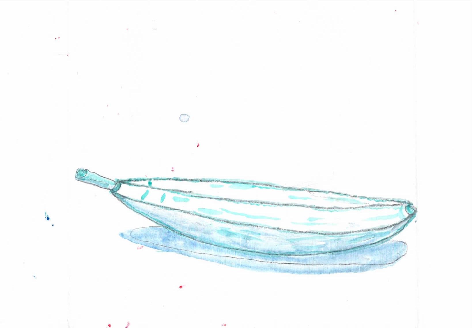 |
ma51a acrylic on A5 paper - towards a banana for a Matisse style fruit bowl. Put in darker areas and shadows. |
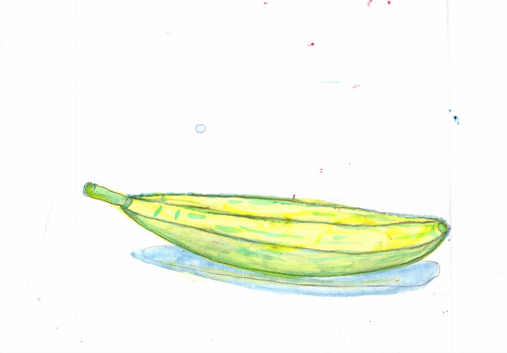 |
ma51 acrylic on A5 paper - a banana for a Matisse style fruit bowl. Glazed with tarsparent yellow |
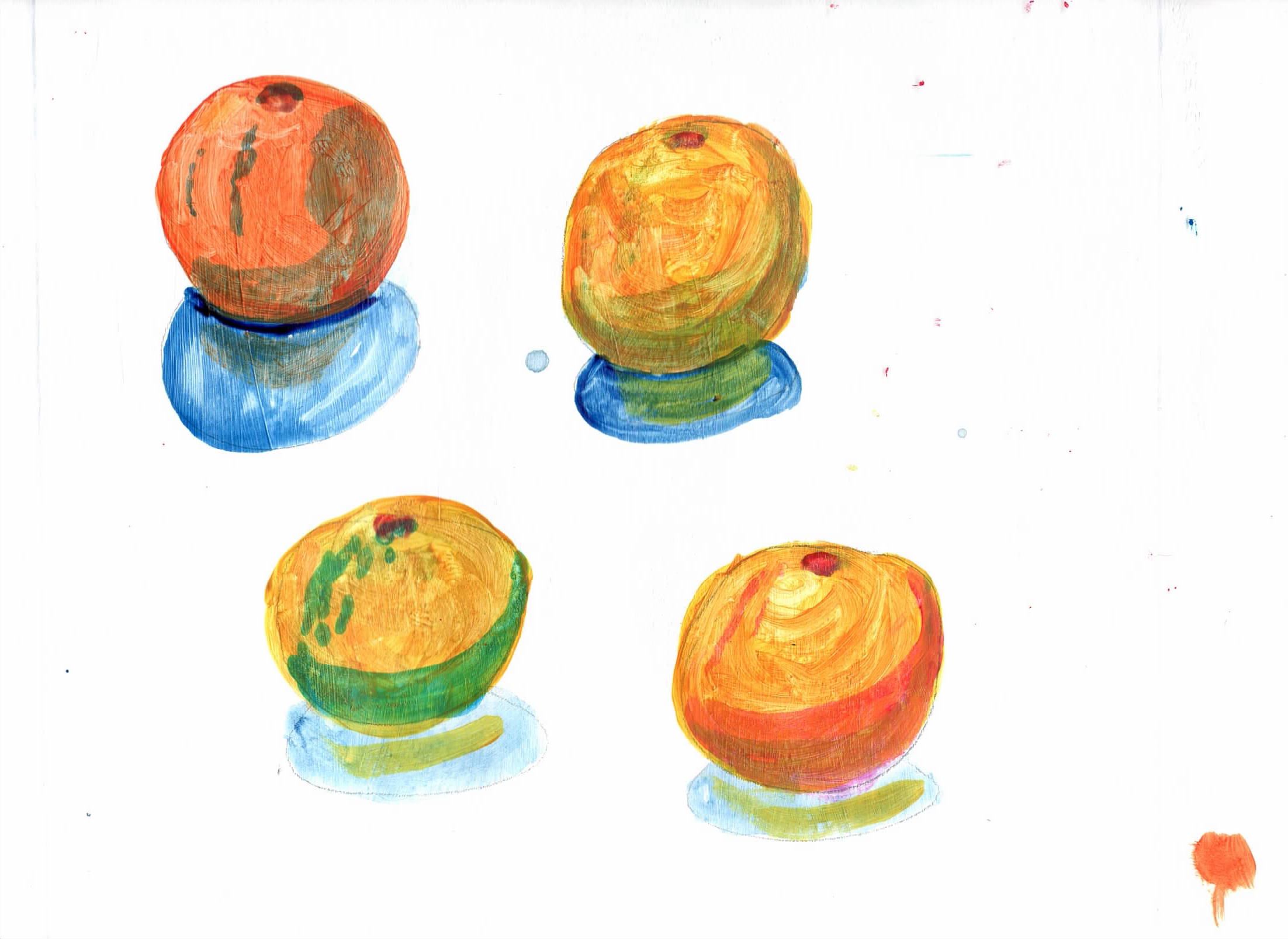 |
ma41 acrylic on A5 paper - oranges for a Matisse style fruit bowl. Put in darker areas and shadows, various colours blues, green and red. Then glazed tarsparent orange |
 |
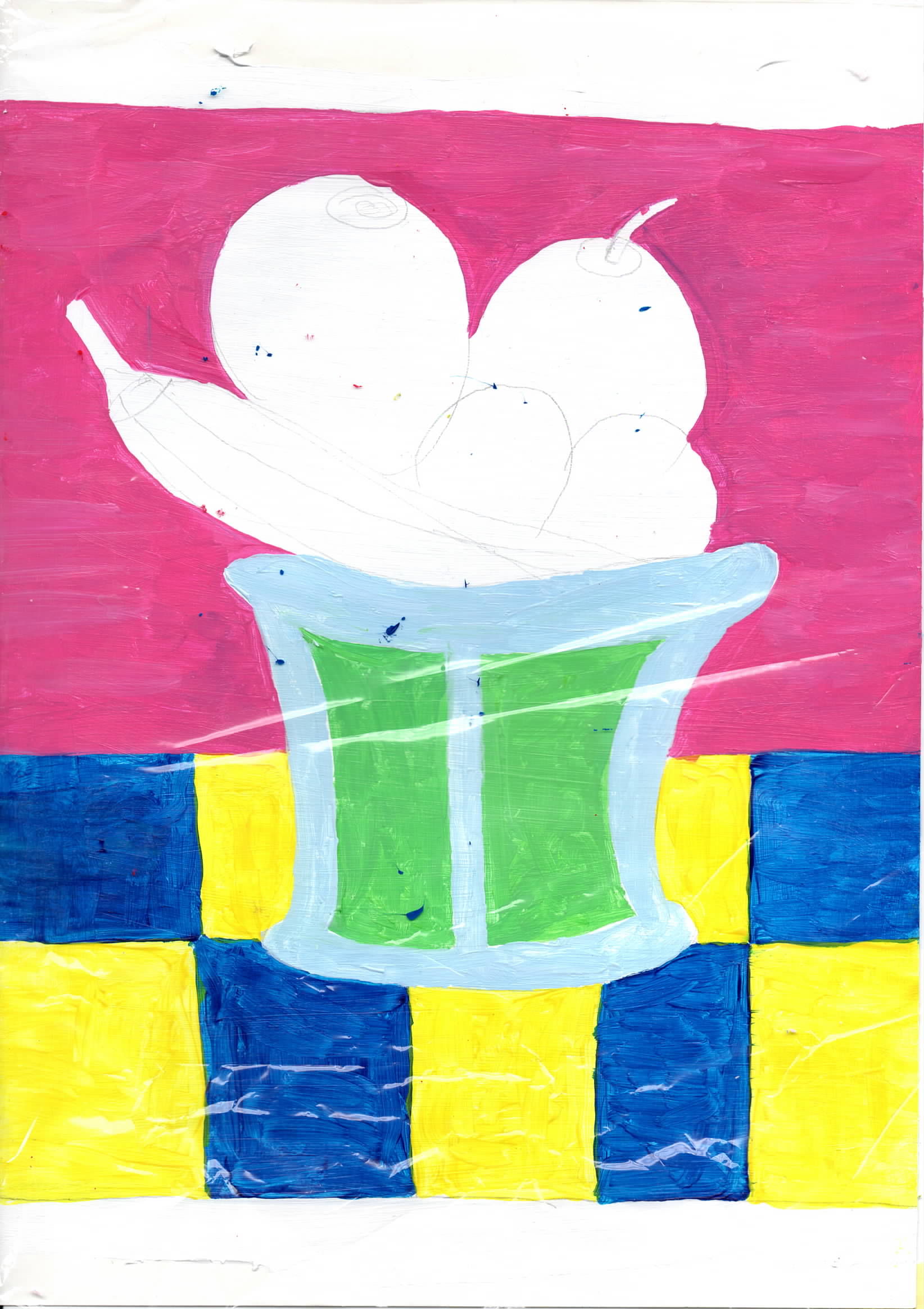
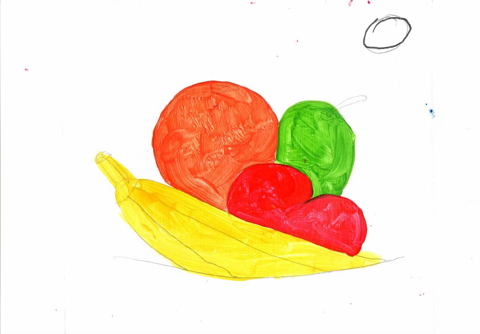
ma52 acrylic on A5 paper - for a Matisse style fruit bowl. The bowl and the fruit are to small. The bowl is bady rendered and looks childish. Th fruit has also come out unformed. I do like the foreground and background. The paints have mixed and become dull. |
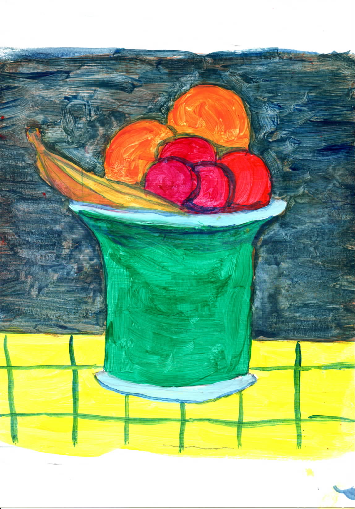 |
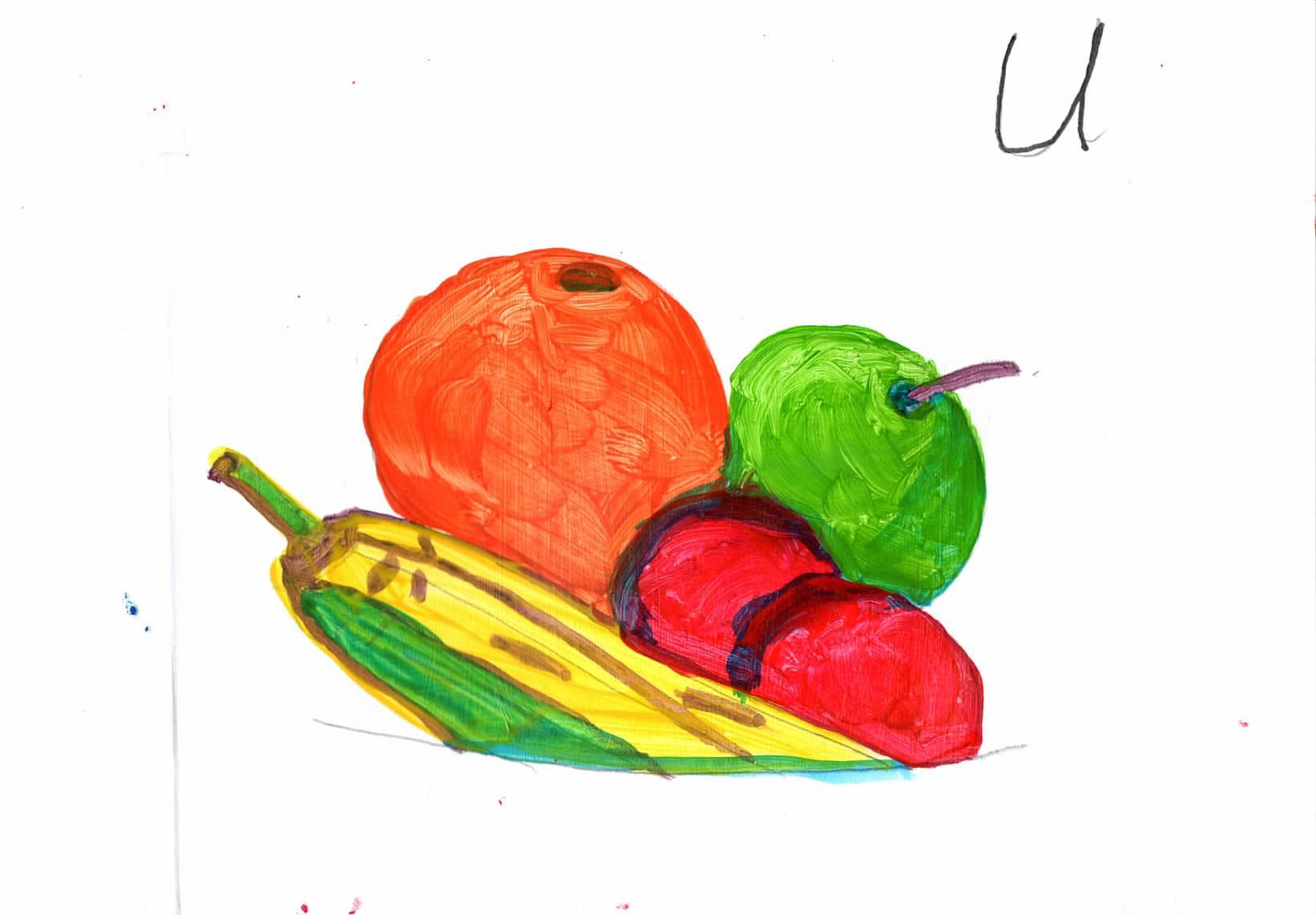
ma53 acrylic on A5 paper - for a Matisse style fruit bowl. Better but still poor. There was meant to be an apple, but it was to samll and bright red, it apperas to be another plum. I don't like background, it is to dark. |
 |
ma42a acrylic on A4 paper - A Matisse style fruit bowl |
 |
ma55 acrylic on A5 paper - Study of fruit - darks underneath - Put in darker areas and shadows. |
 |
ma56 acrylic on A5 paper - Study of fruit - darks underneath - Add main colours. Some of the shadow colours work well, but for the plumbs the colours is to dark. |
 |
ma56 acrylic on A5 paper - Study of fruit - darks on-top - Apply main colours. |
 |
ma56 acrylic on A5 paper - Study of fruit - darks on-top - Put in darker areas and shadows. |
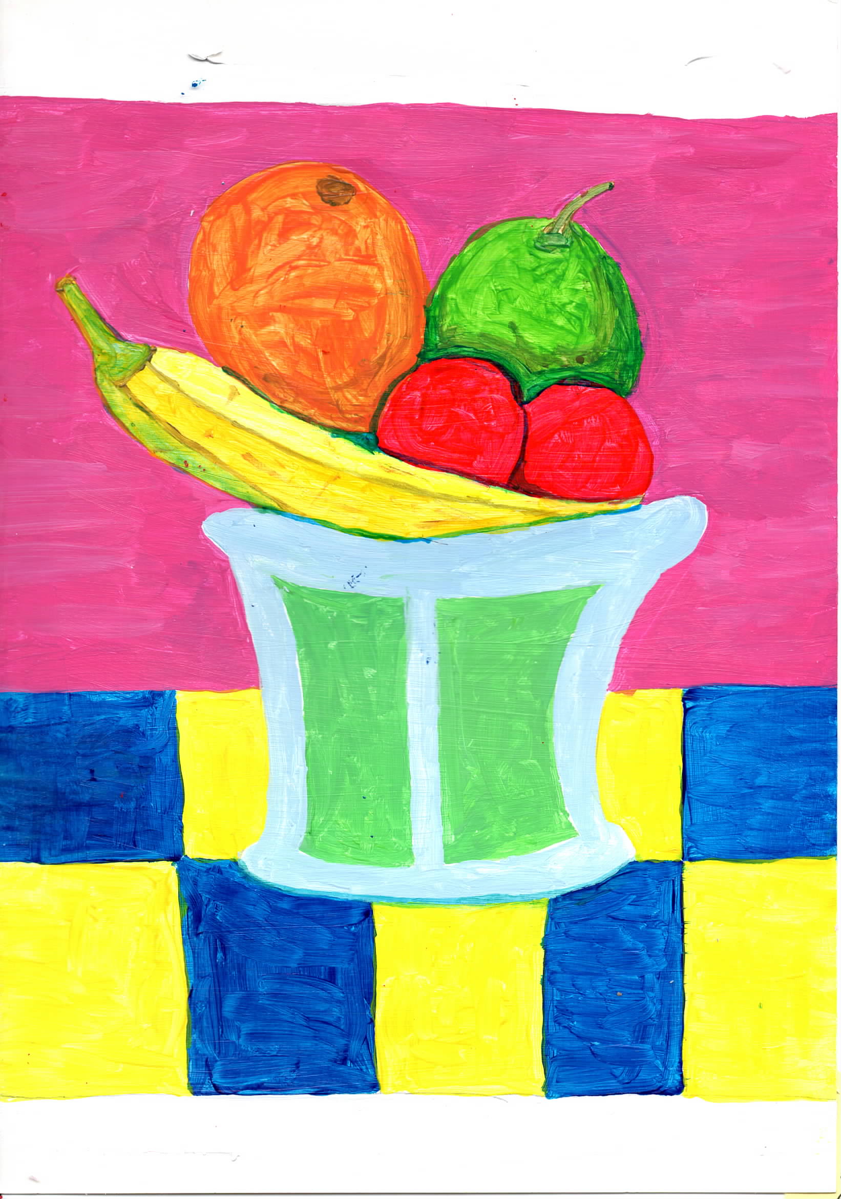 |
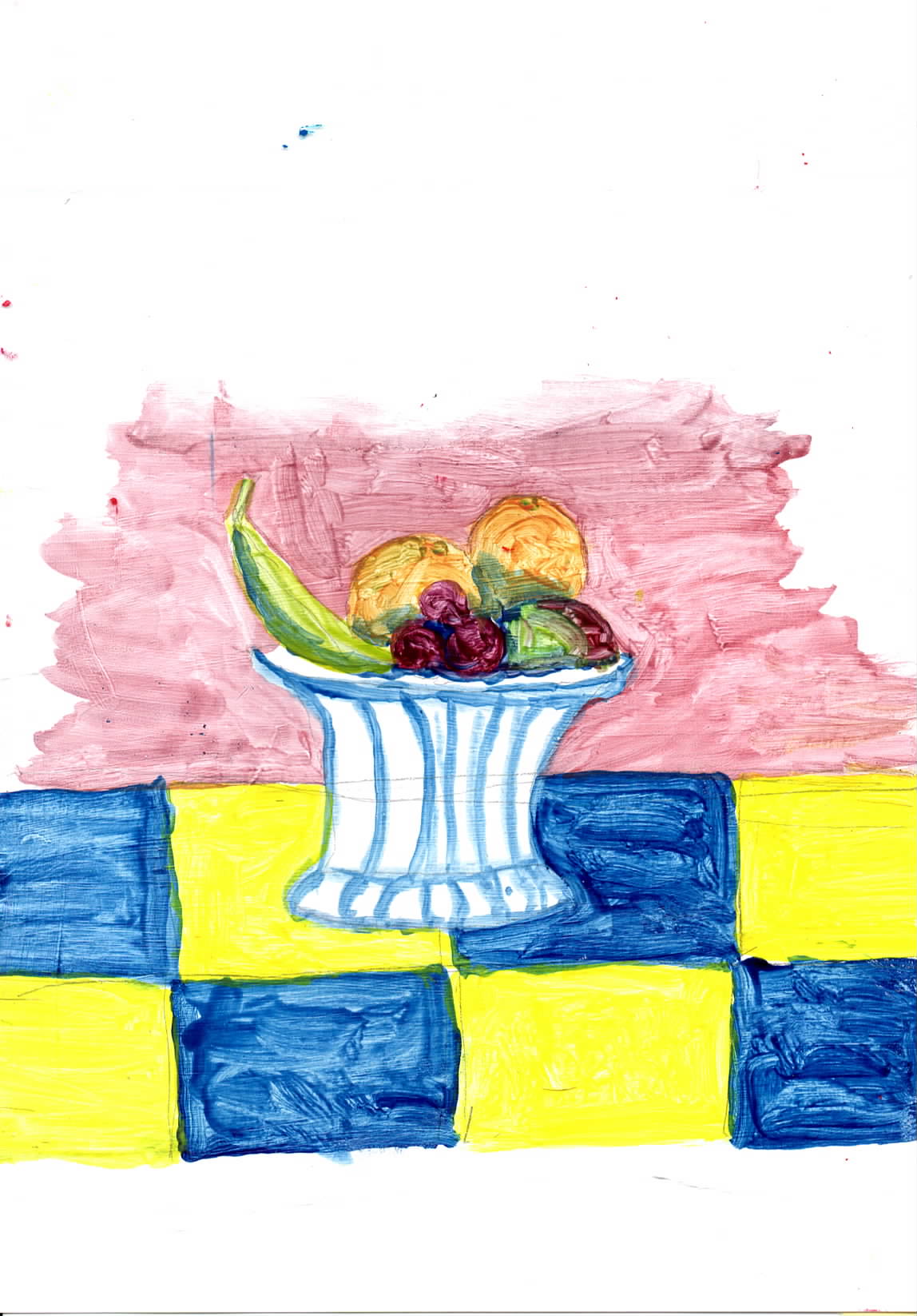
ma43 acrylic on A4 paper - A Matisse style fruit bowl. I decided to use the darks over the main colours. I like the bright colours, the fine brush work is a bit wobbly, but the overall effect is very pleasing. |
 |
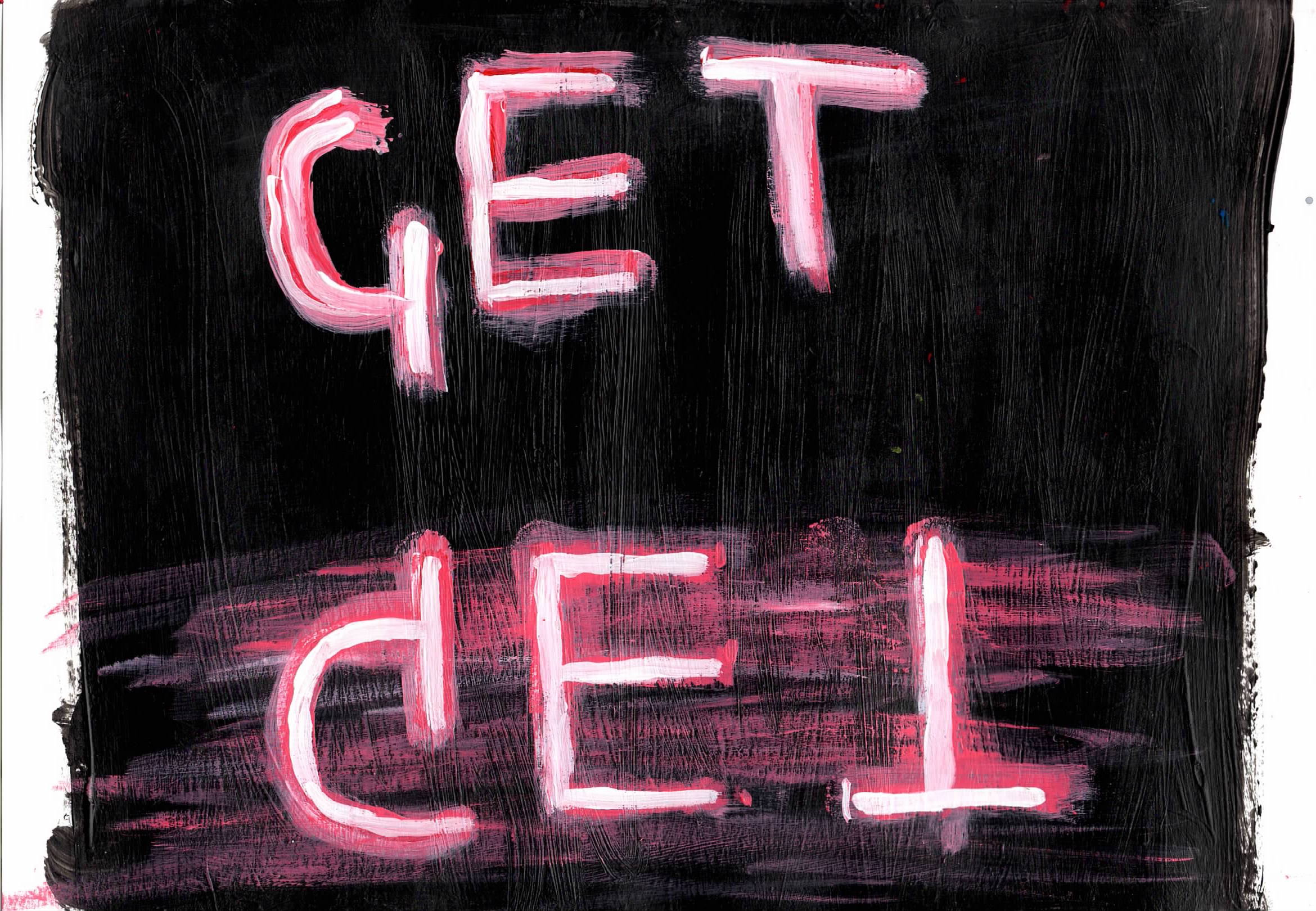
nea41a acrylic on A4 paper - towards a neon style sign Relected light from scattered areas would lie within the bounds of the reflected sign. Paints have no brightness |
 |
nea41 acrylic on A4 paper - towards a neon style sign, above ammended |
 |
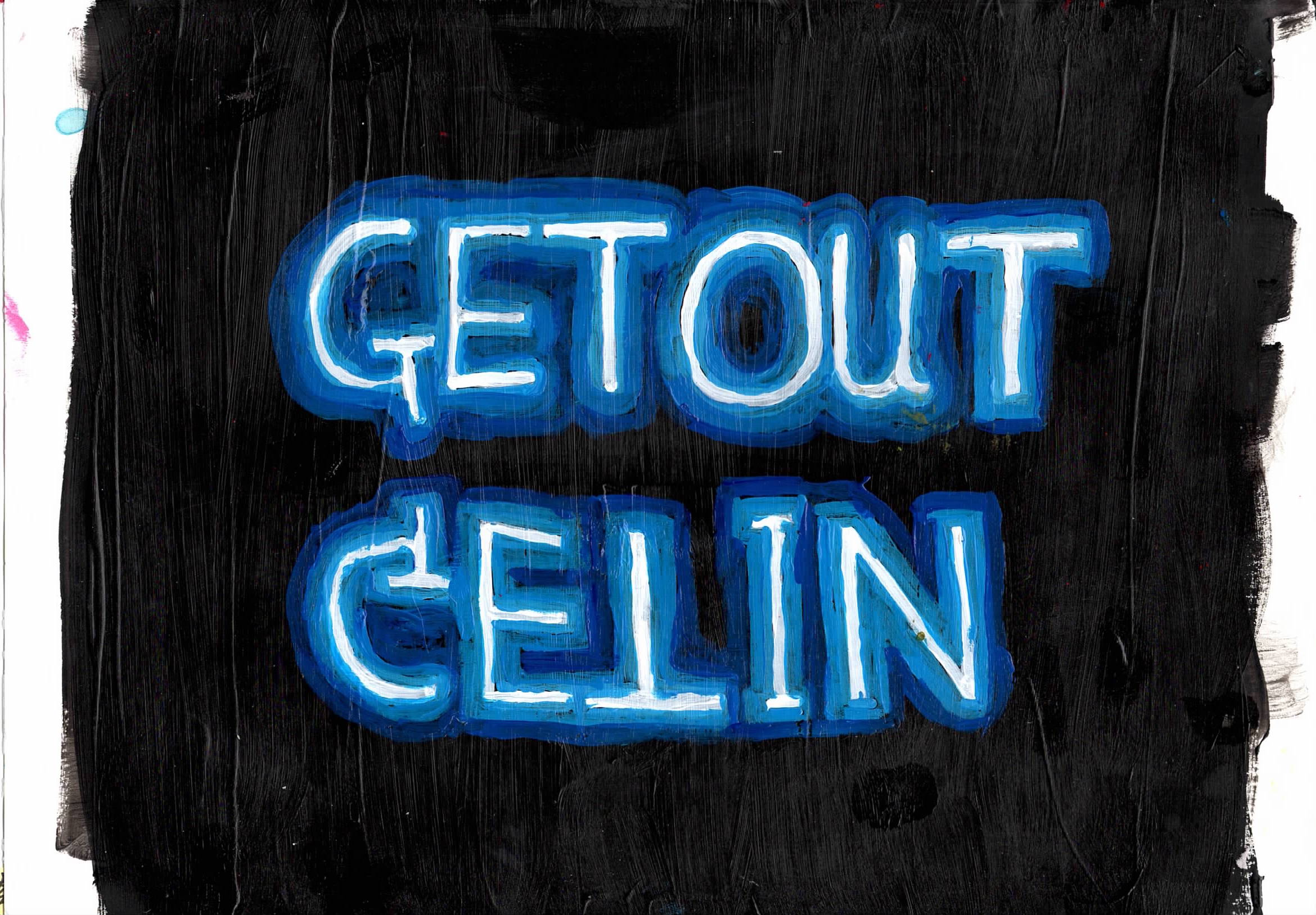
nea51a acrylic on A5 paper - towards a neon style sign Reflected light would be directly between the viewer and the light source. Paints have no brightness |
 |
nea51 acrylic on A5 paper - towards a neon style sign, above ammended |
 |
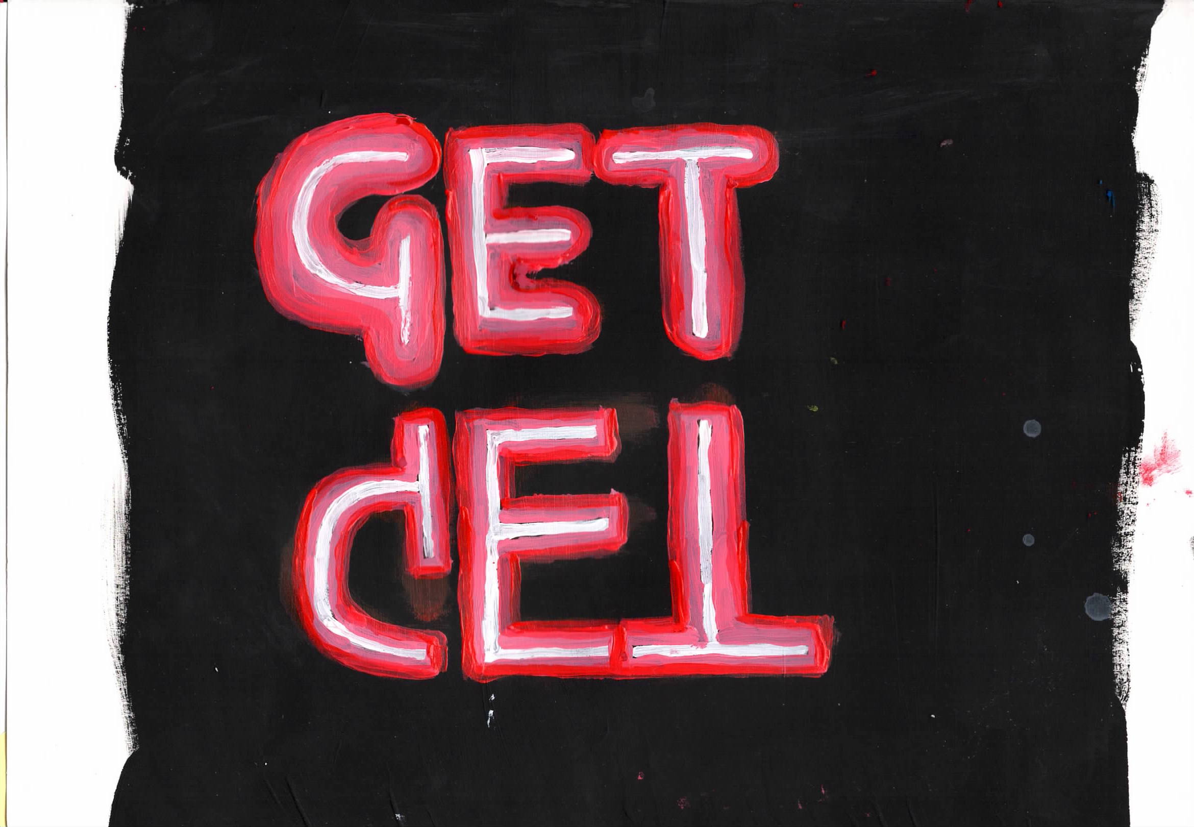
nea42 acrylic on A4 paper - towards a neon style sign |
 |
nea43 acrylic on A4 paper - towards a neon style sign |
 |
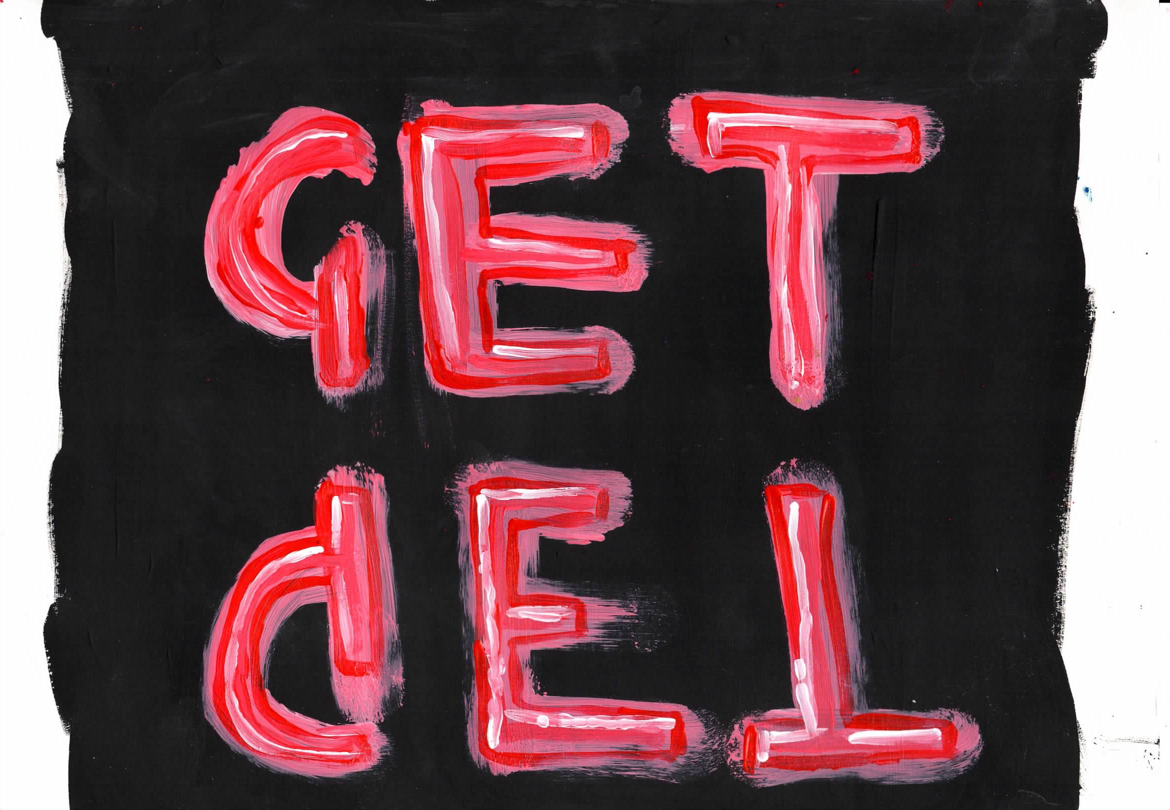
nea44 acrylic on A4 paper - towards a neon style sign The best one so far - neon signs need to be well formed and well painted, white in middle then darker hues radiating out. |
 |
nea45 acrylic on A4 paper - A neon style sign |
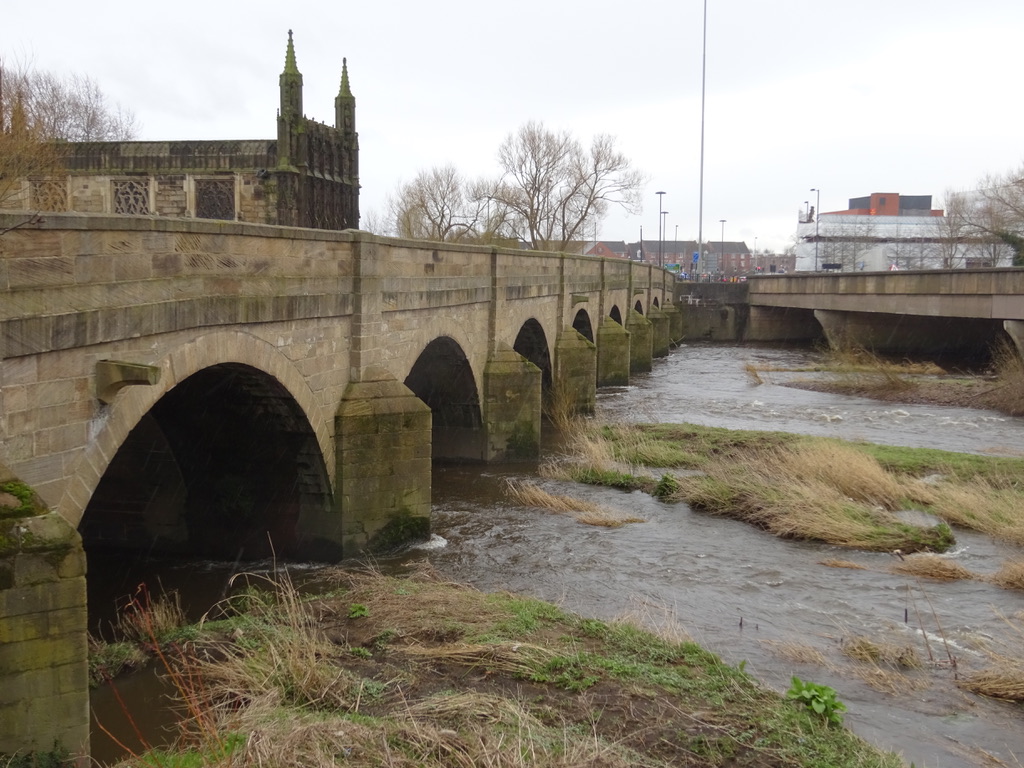 |
Photos of bridge, with Chantry Chapel. |
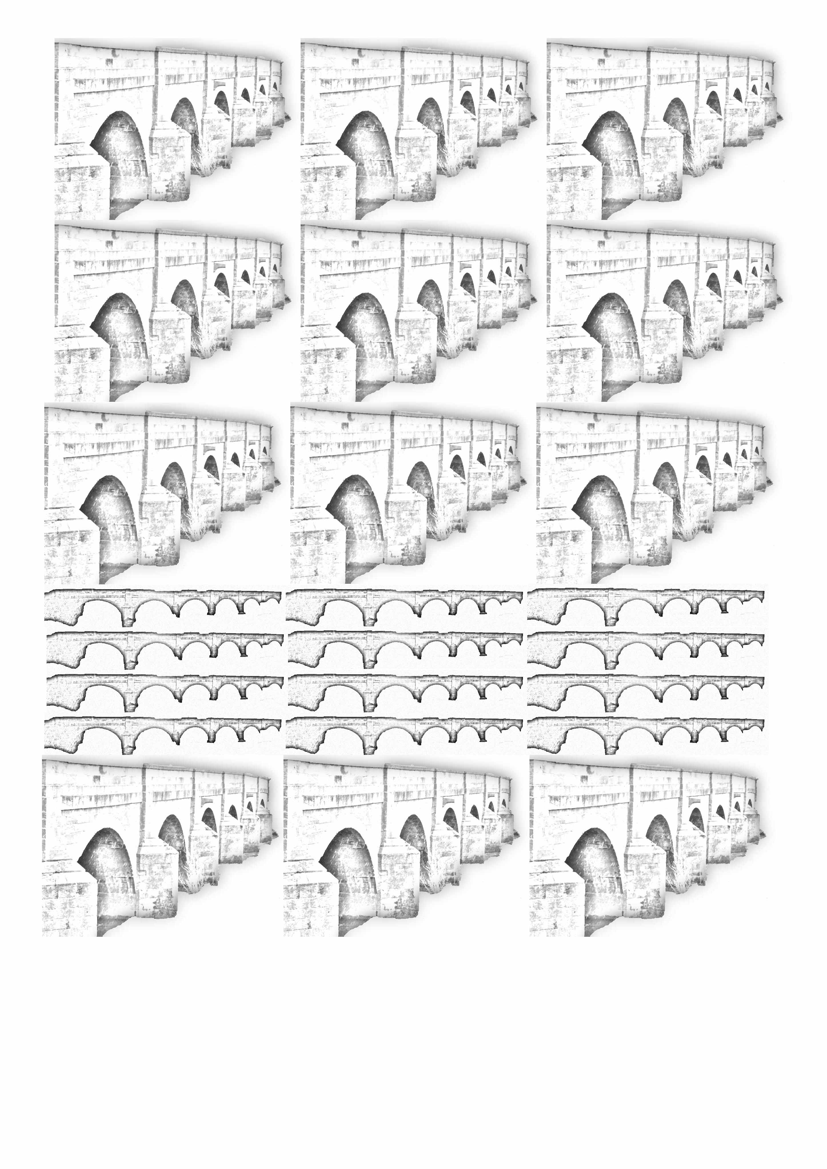 |
Photos of bridge, Photoshopped, and combined onto A4 sheet. |
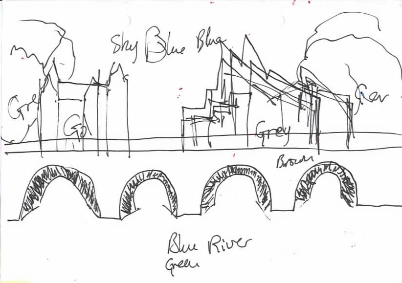 |
Sketch for final layout. Chantry Chapel is in the correct place, The Hepworth Gallery has been moved for this work. |
 |
Sketch colours, with my selected. But some colours had to be mixed, which did not suit the style so I decided to use a different set of colours. I decided to change the colour of the Hepworth to a brighter / paler colour. |
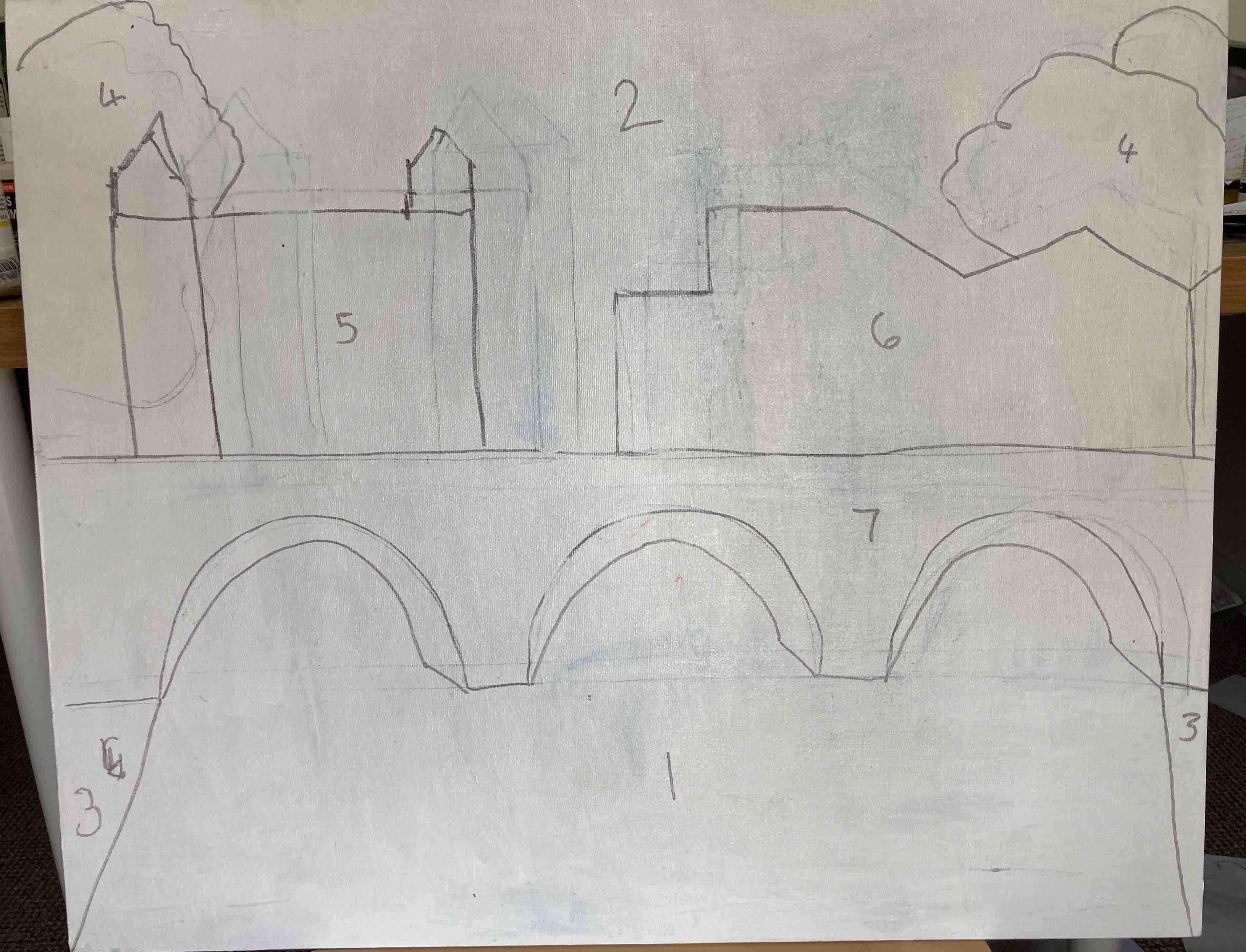 |
Canvas board with outline for collage, the numbers are the order to do the collage. |
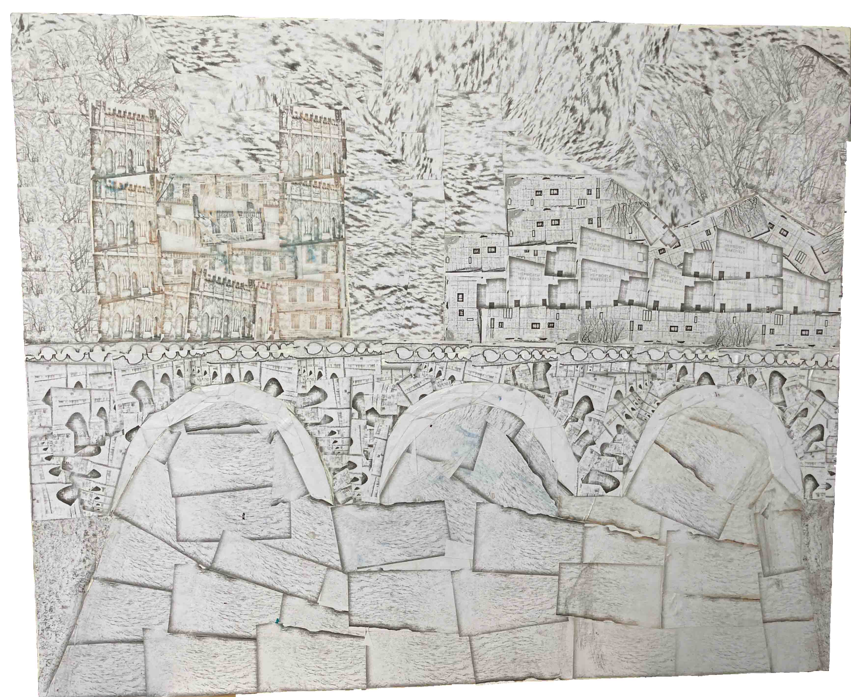 |
Collage done. |
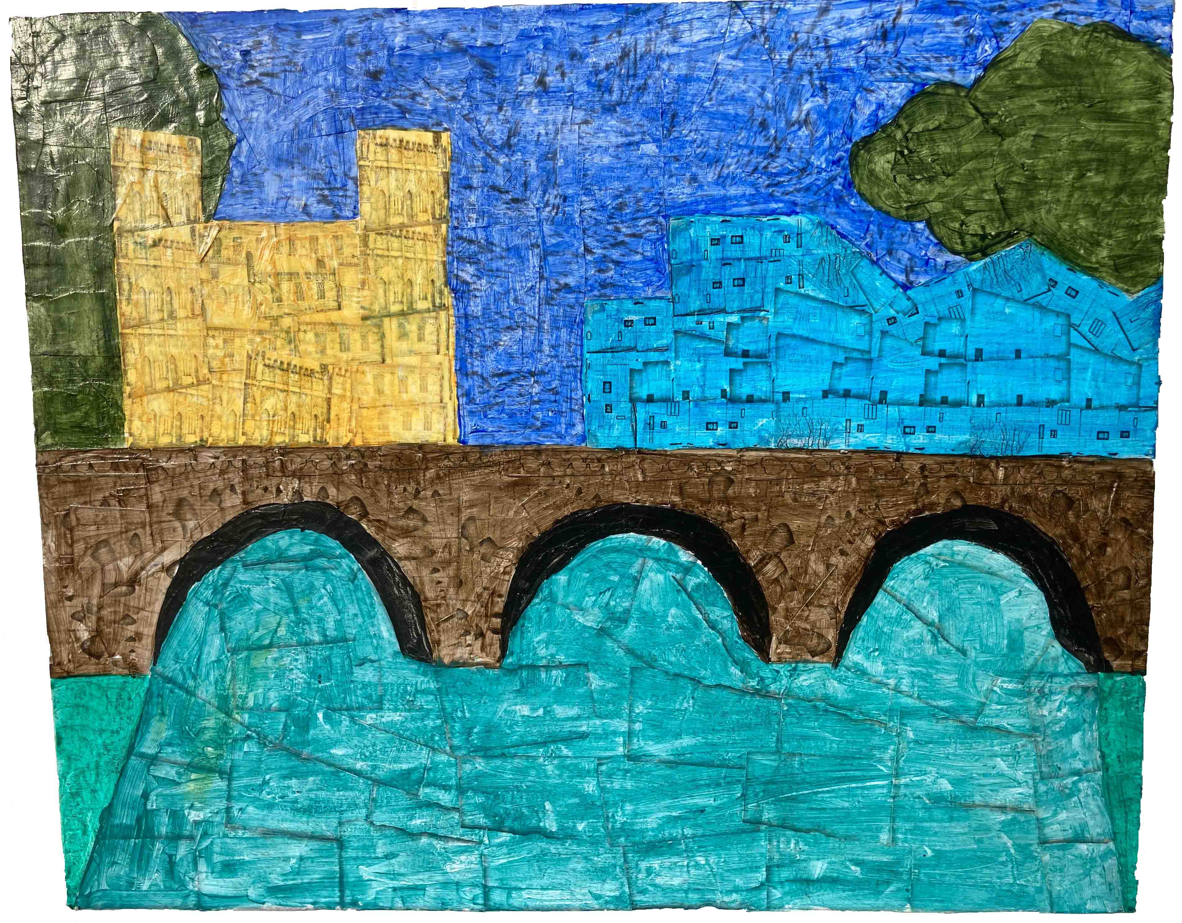 |
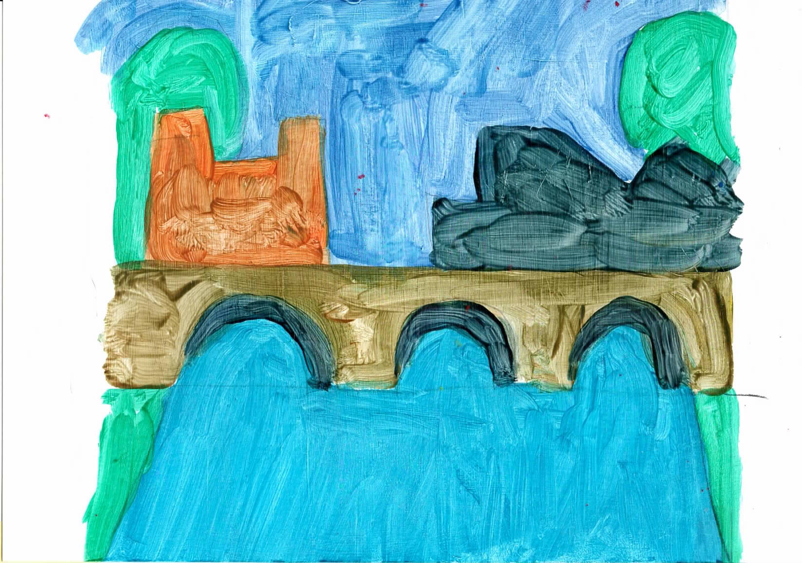
ba23 - "22 x 18" - Acrylic over collage. To get very trasparent bright colours I had to use a differnt set of colours from my given set. I still used Golden OPEN but with - Sap green, Cobolt Turquise, I still used Golden OPEN but with - Sap green, Cobalt Turquoise, Ultramarine Blue, Indian yellow, Manganese Blue Hue, Vandyke Brown with some Pthallo Green (BS). The Manganese Blue is a brighter blue than I was hoping for, and so starts to disapear into the sky. I had to buy the Turquoise especially for this painting. I thought the Manganese Blue would be paller, I could not find a transparent pale grey. |