|
Fauvist Face as a start point for this exporation. I am really pleased with this work - while I was trying to work with blocks of pure colour I ended up doing a pixelated work using dabs of colour, I did some colour shading to add shadow areas. |
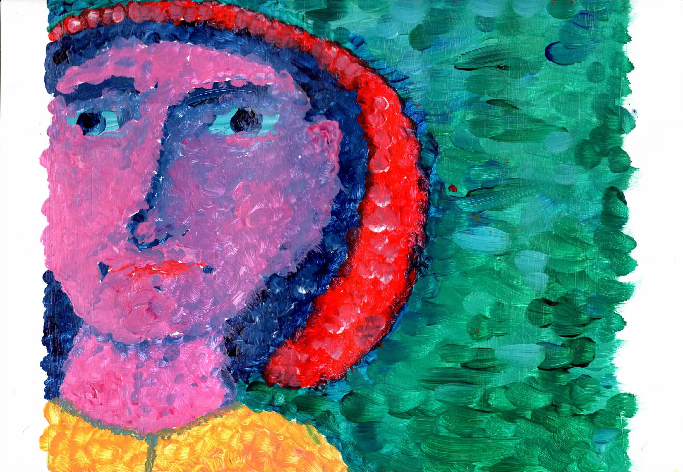 |
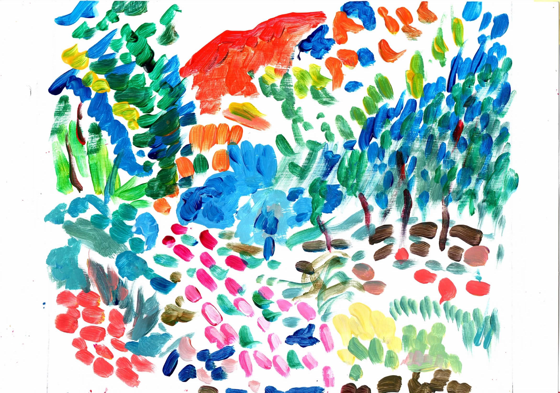
ffa41 Acrylic on A4 paper - from my Fauvist face - I like this one the magenta skin tone is more interesting. I tried to work with Divided Brushwork, but it accidentally stared to dab painting. Using dab painting with on surface paint mixing created some interesting effects, so carried on using the style. |
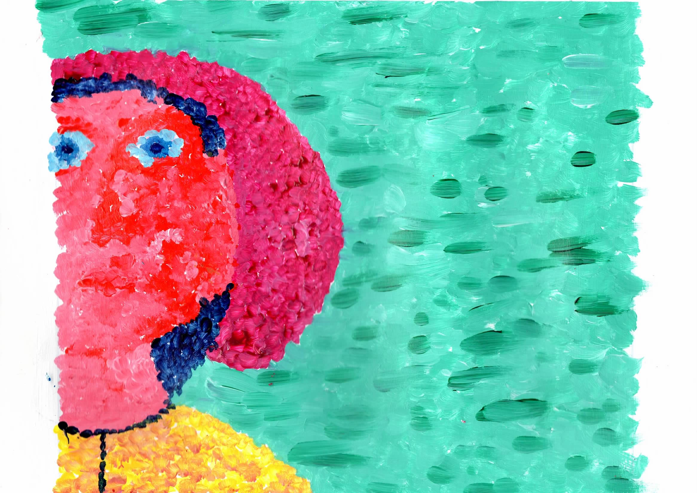 |
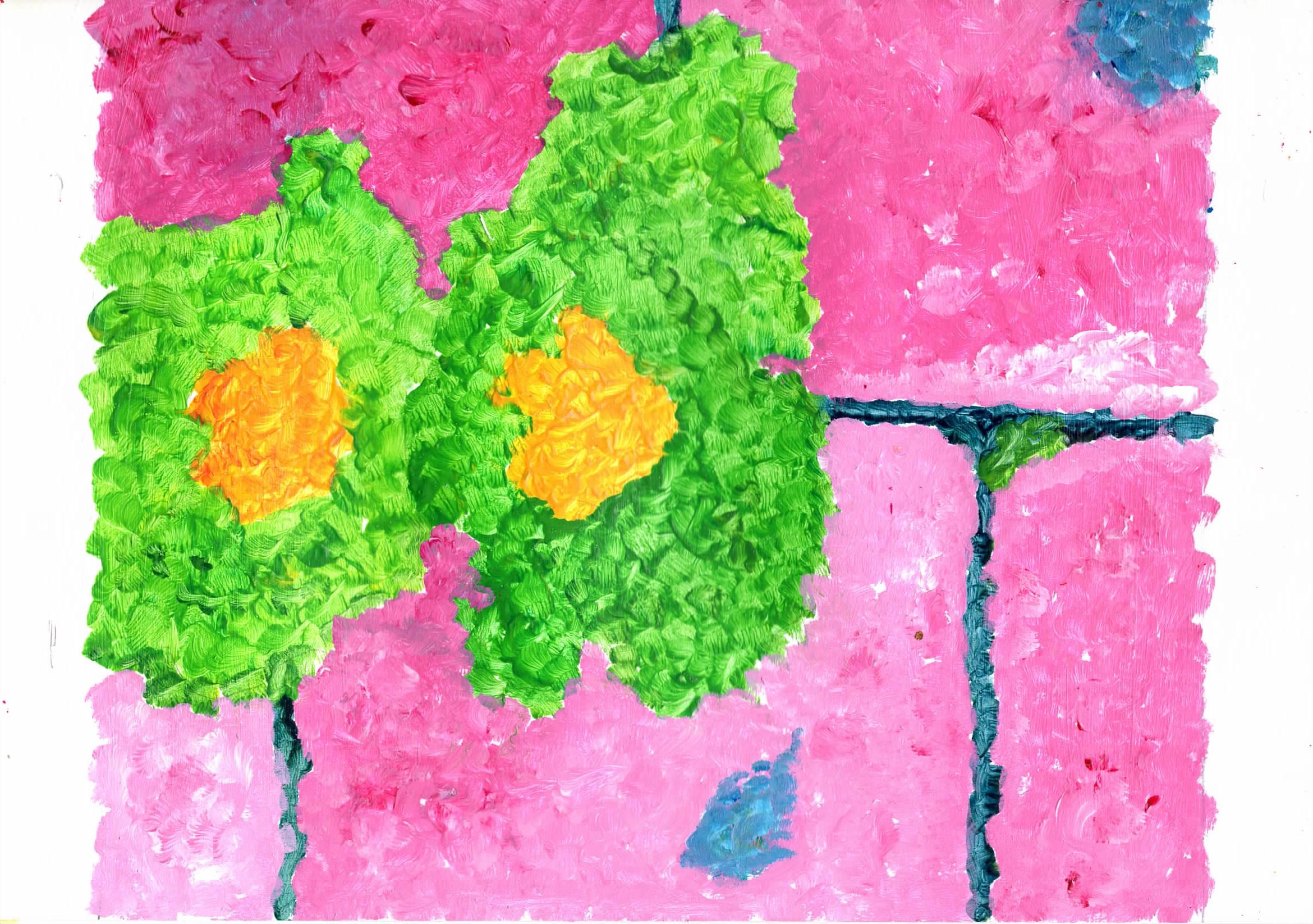
ffa42 Acrylic on A4 paper - I wanted to try above again, but use colour to create shadows and bring in more contrast - still interesting but not as good as above, 1st on has depth, 2nd seems flat. I dislike the bright red face, it just looks wrong, but I need to keep trying. |
|
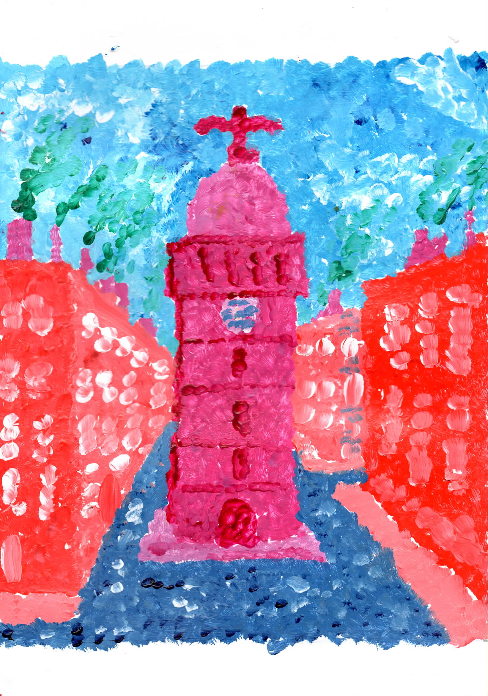
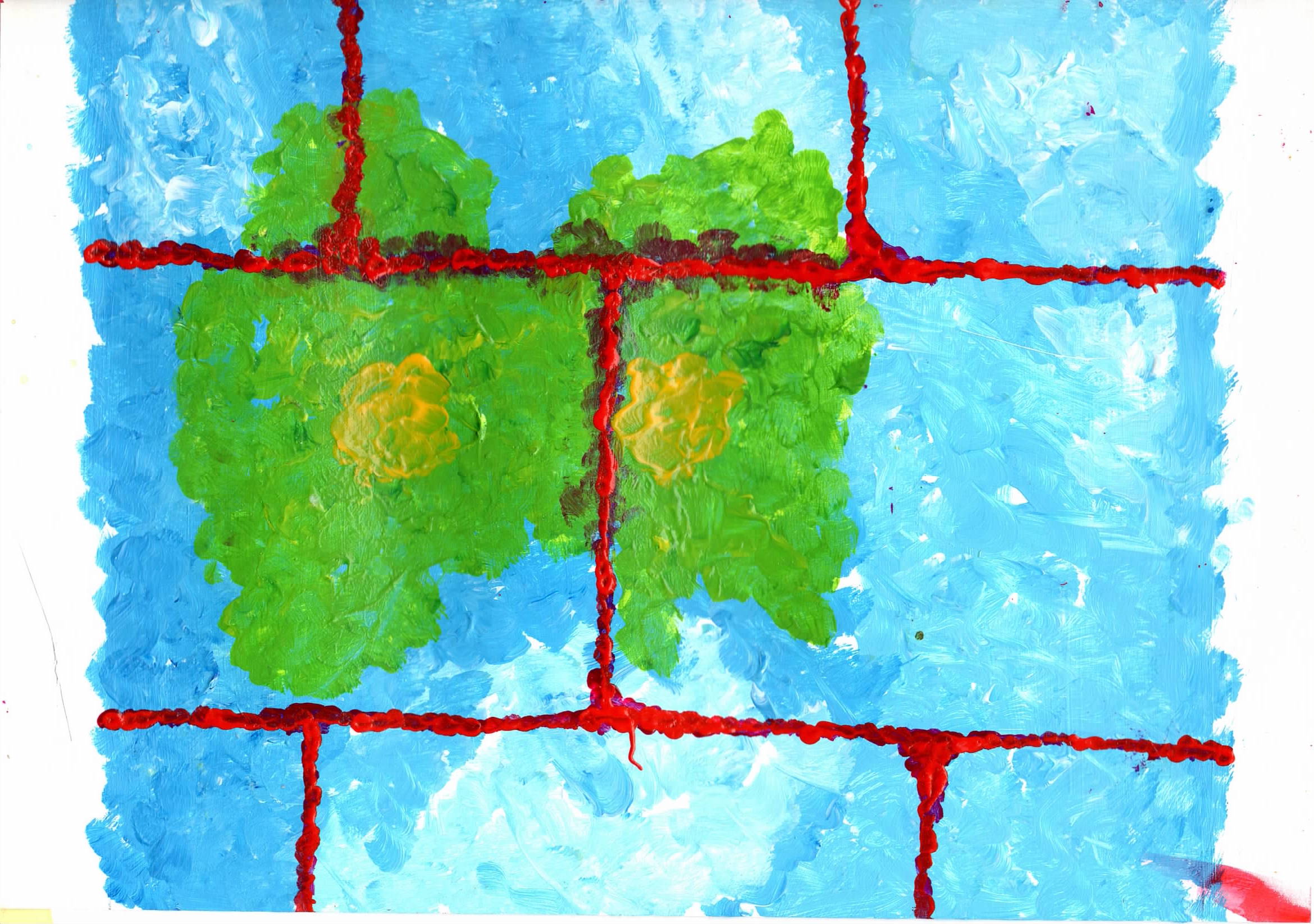
Fauvist Face but adding interest on the RHS. |
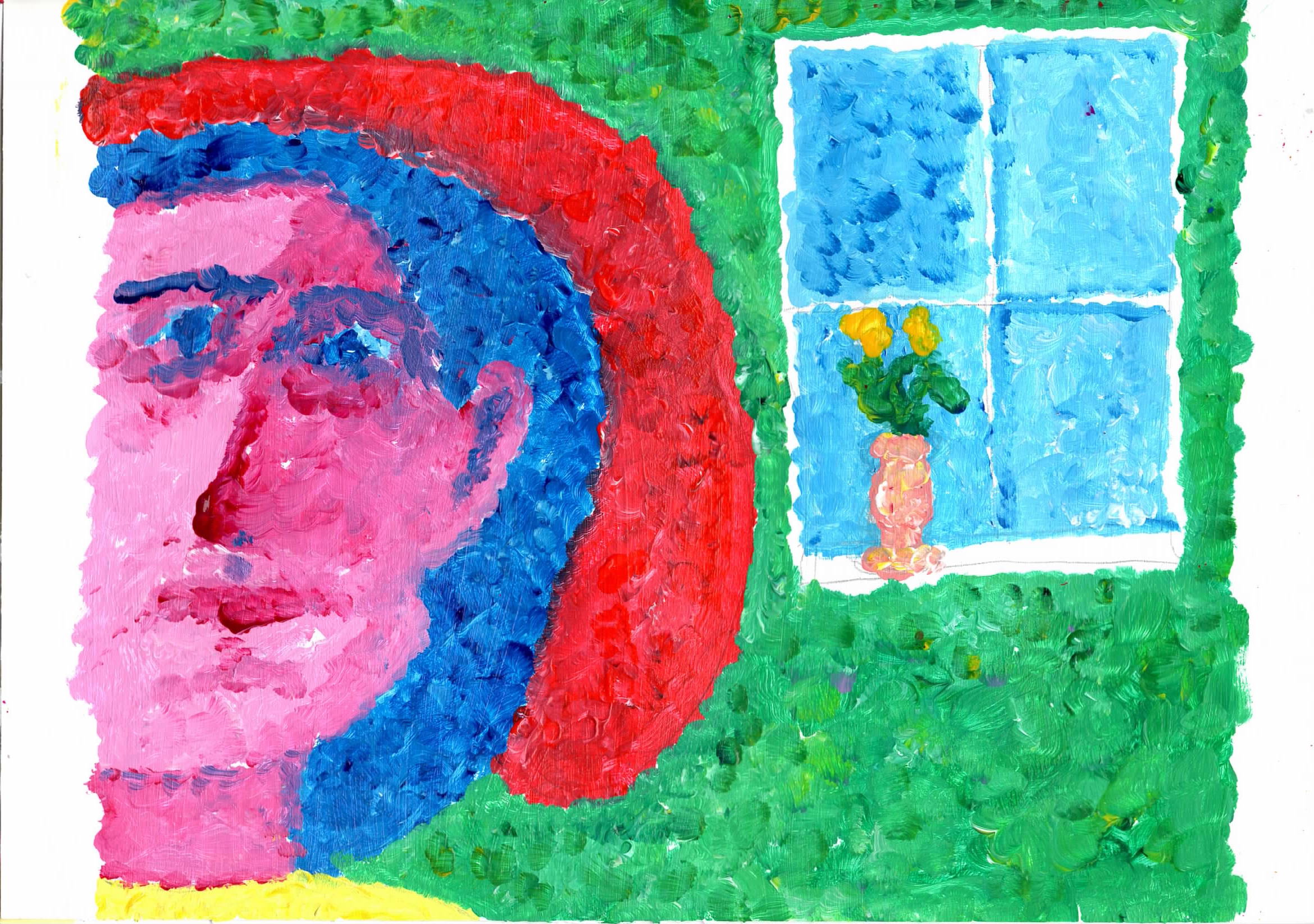 |
ffa43 Acrylic on A4 paper - on RHS I added a window and flower vase. Matisse (and others) used windows as farming device. The face is slightly narrow. I think this work has a life about it. |
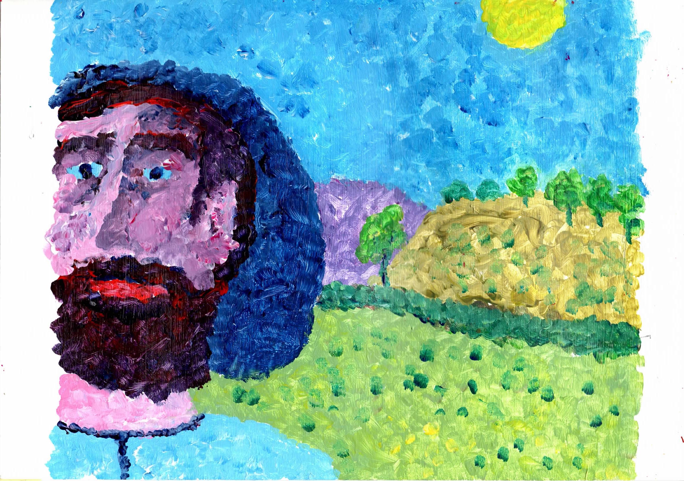 |
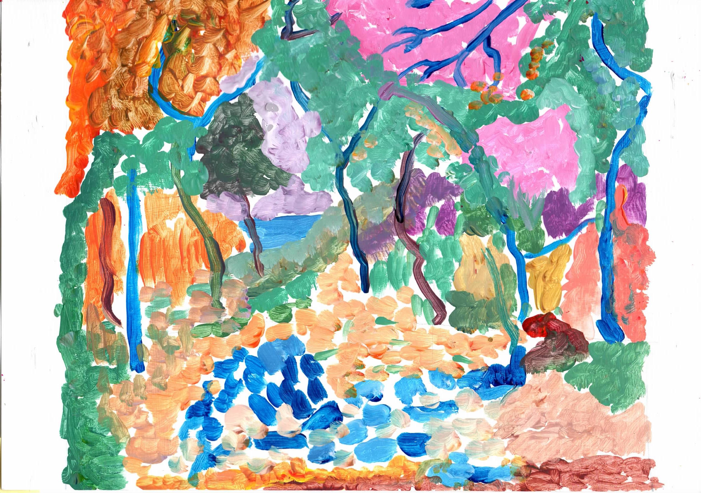
ffa44 Acrylic on A4 paper - ffa44 - on RHS I added an imagined landscape scene. The skin tones are slightly paler and more natural. I think this is a lively painting. |
|
Fauvist Face but adding RHS of Mona Lisa on LHS. |
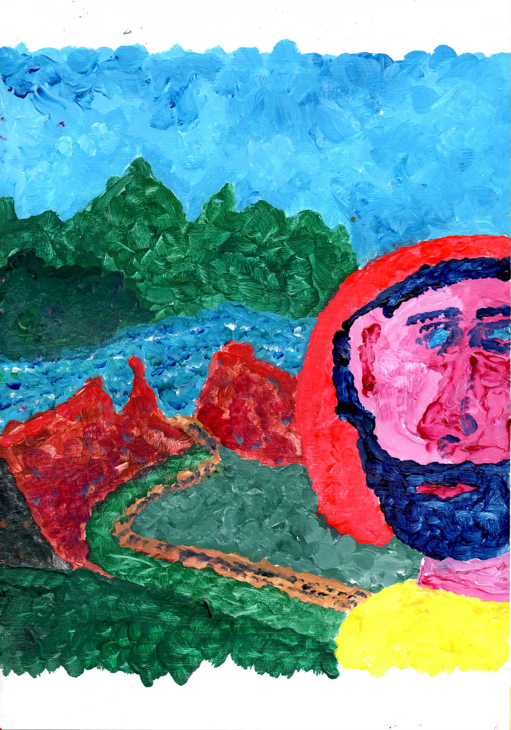 |
ffa45 Acrylic on A4 paper - on LHS I added landscape scene from the LHS of the Mona Lisa. The face is poorly defined and not good. The landscape has good colours, but the river seems to flow uphill. I think this is a dull painting. |
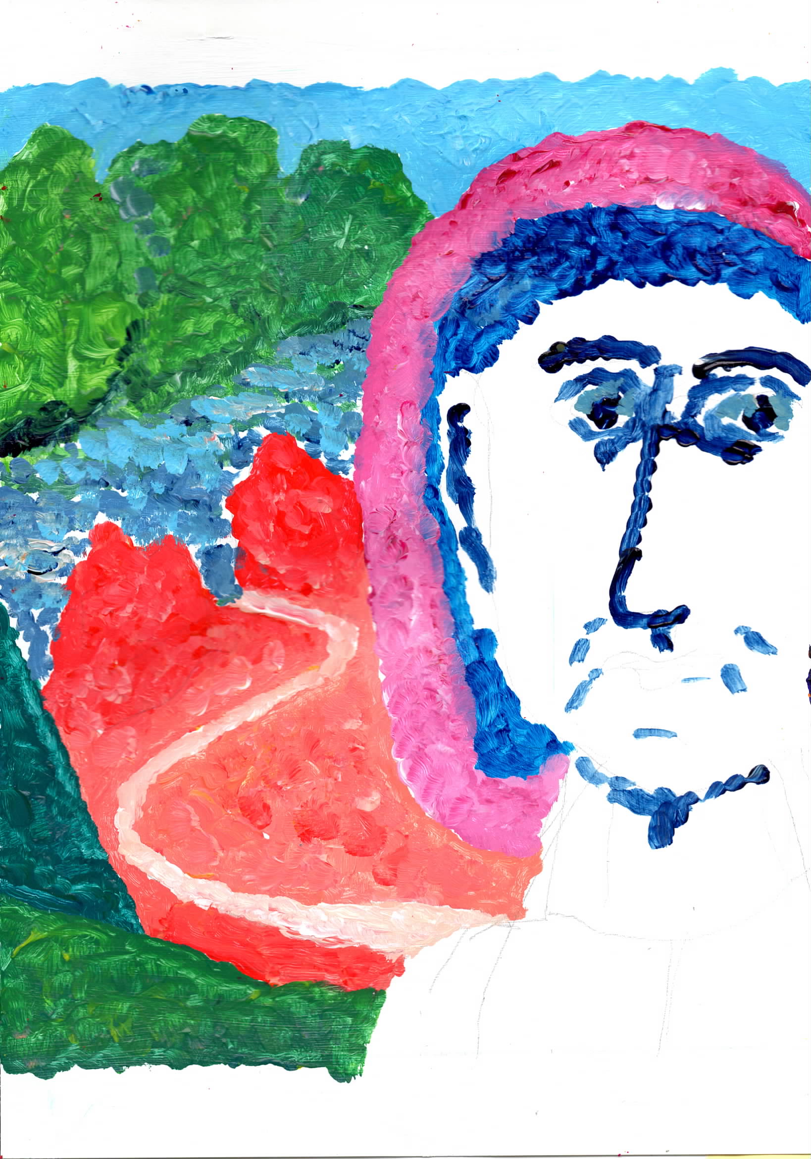 |
ffa46 Acrylic on A4 paper - on LHS I added landscape scene from the LHS of the Mona Lisa. The face is poorly defined and not good. I did not add any skin tones as it looked interesting with a lot of white. The eyes are too close together. The landscape has colour, but the river is painted better. I think this is a dull painting. |
|
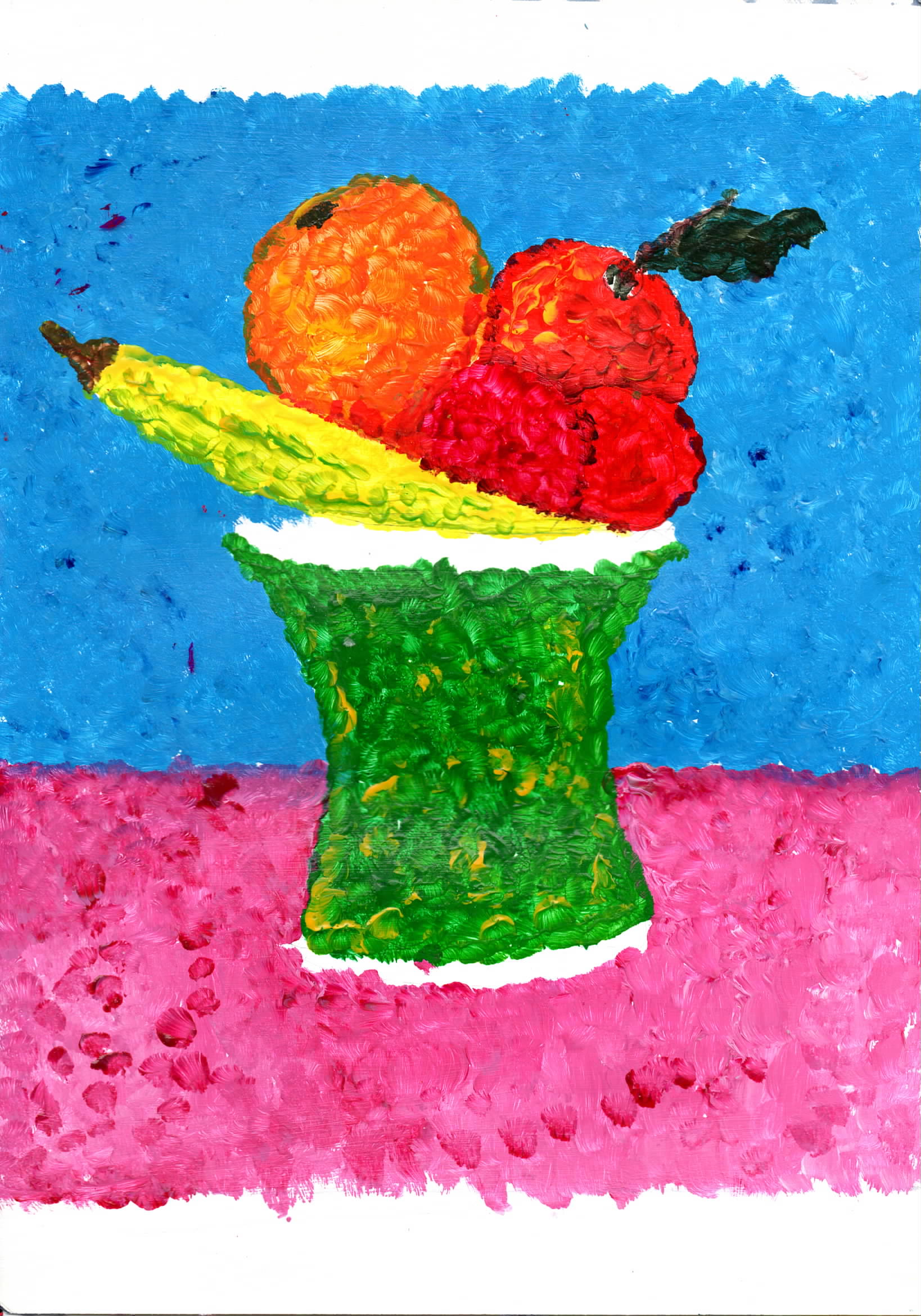
Fauvist Vase. Back to the vase painting I did last year. Painting with contrast, tints and dabs. |
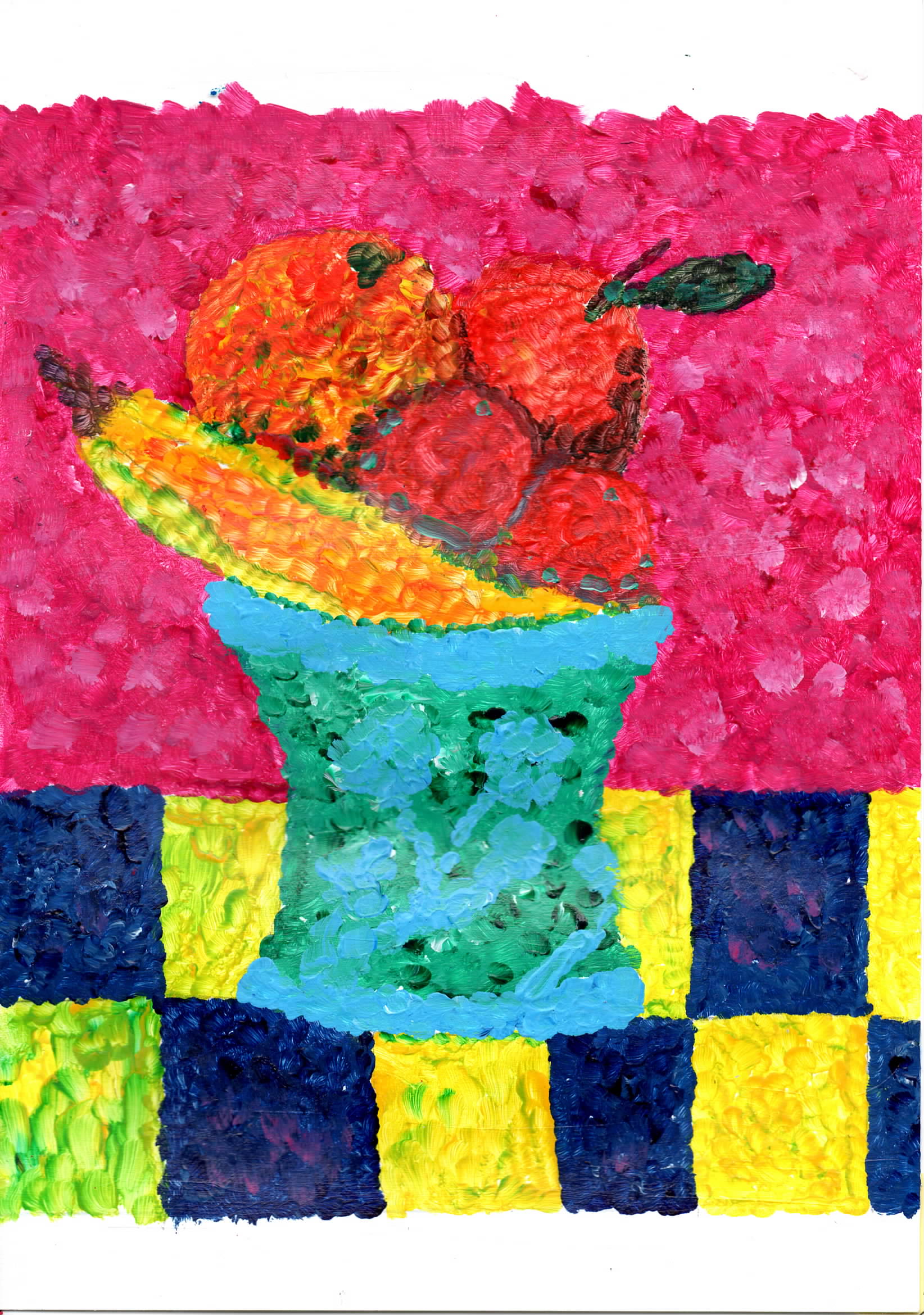 |
fva41 Acrylic on A4 paper - From my Matisse Fruit bowl - I am really pleased with this work, I did some colour shading to add shadow - a fault is low contrast between the fruit and the background, other fault is pattern on vase is the pattern is not pale enough.
. |
 |
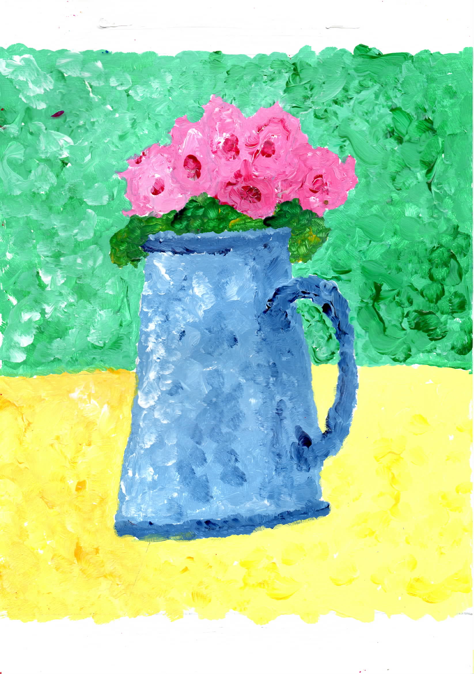
fva42 Acrylic on A4 paper - To bring out the colour of the fruit I used a very contrasting colour to bring them out. At the end I decided that the background needed more interest and there should be different hues / shades dividing the areas into 2 not quite the same. |
 |
fva43 Acrylic on A4 paper - playing with fva42 and shading so the background areas to have some variation. The yellow dose have two areas but of low contrast. |
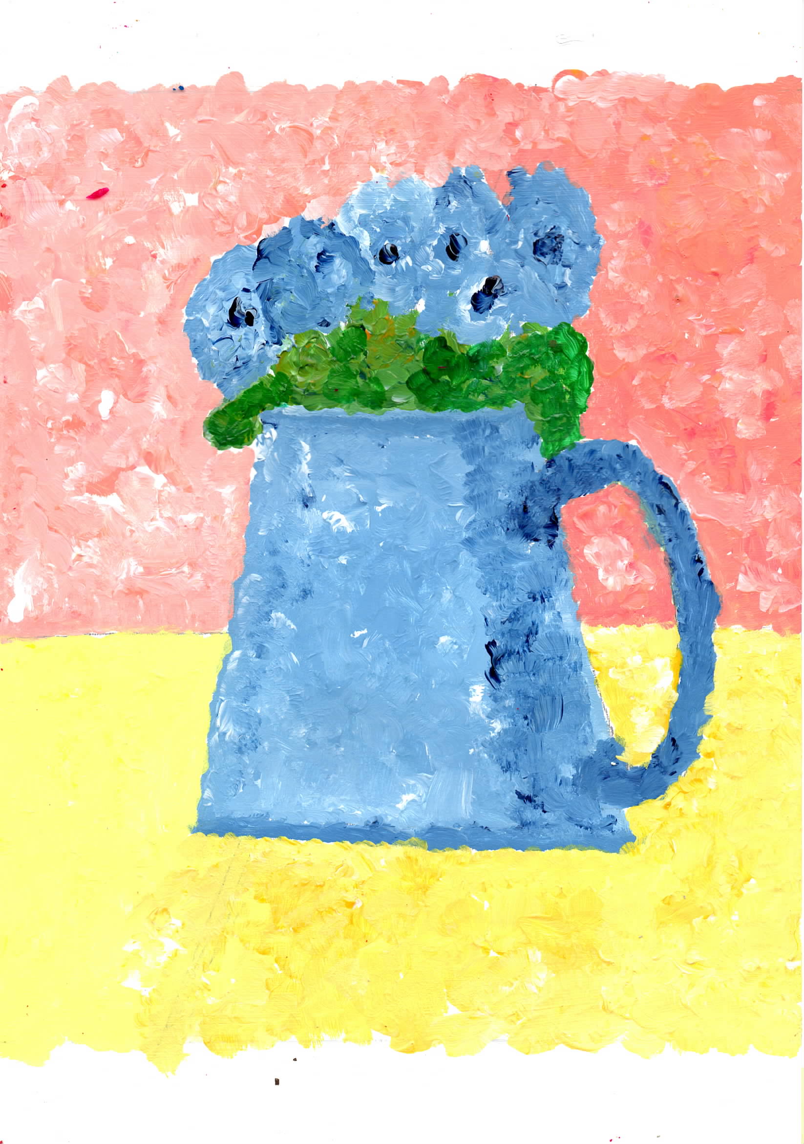 |
fva44 Acrylic on A4 paper - playing with fva42 and shading so the background areas to have some variation. The yellow dose have two areas but of low contrast. |
|
Fauvist ideas- Wakefield Bridge and a sceane after L.S. Lowery. |
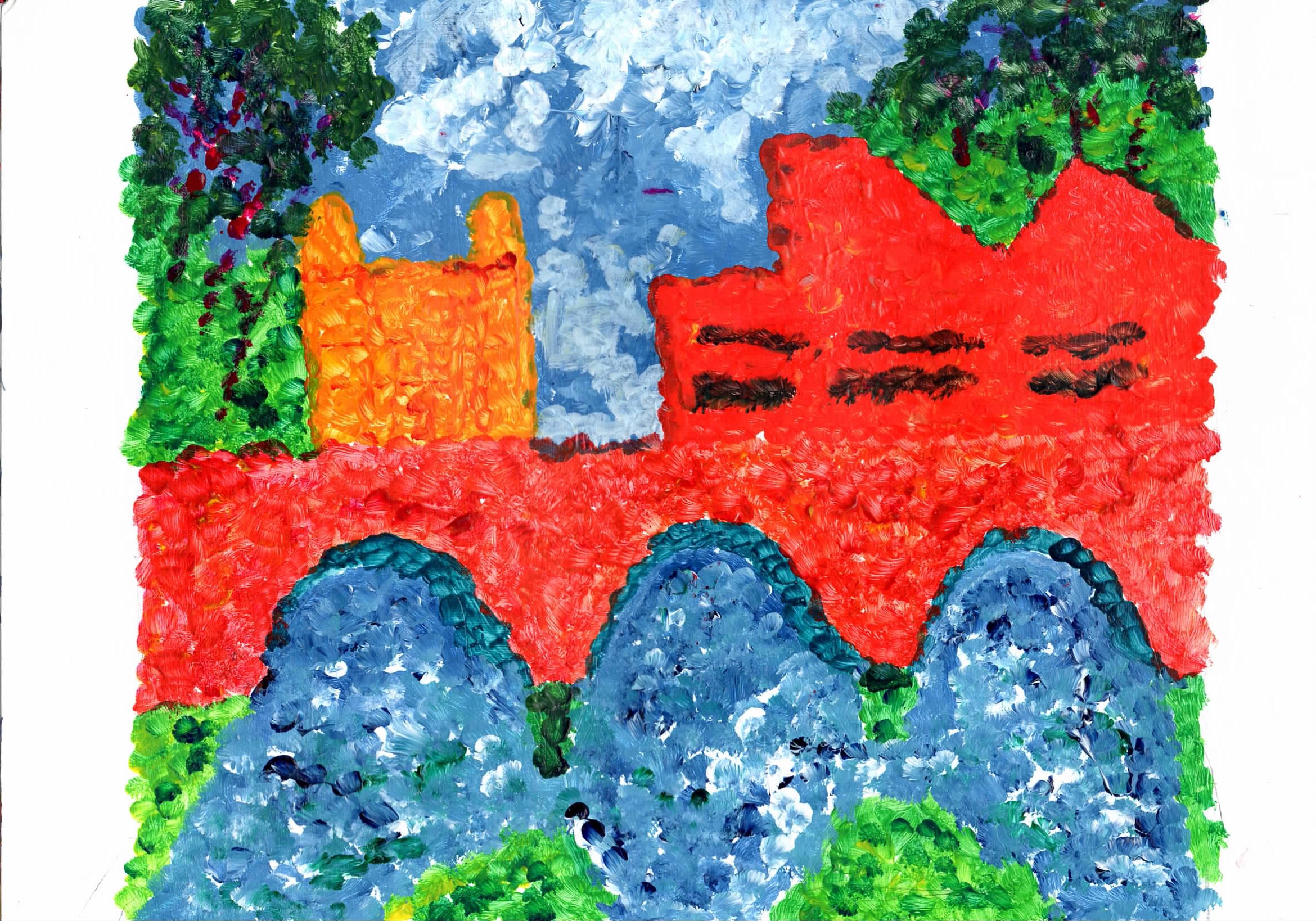 |
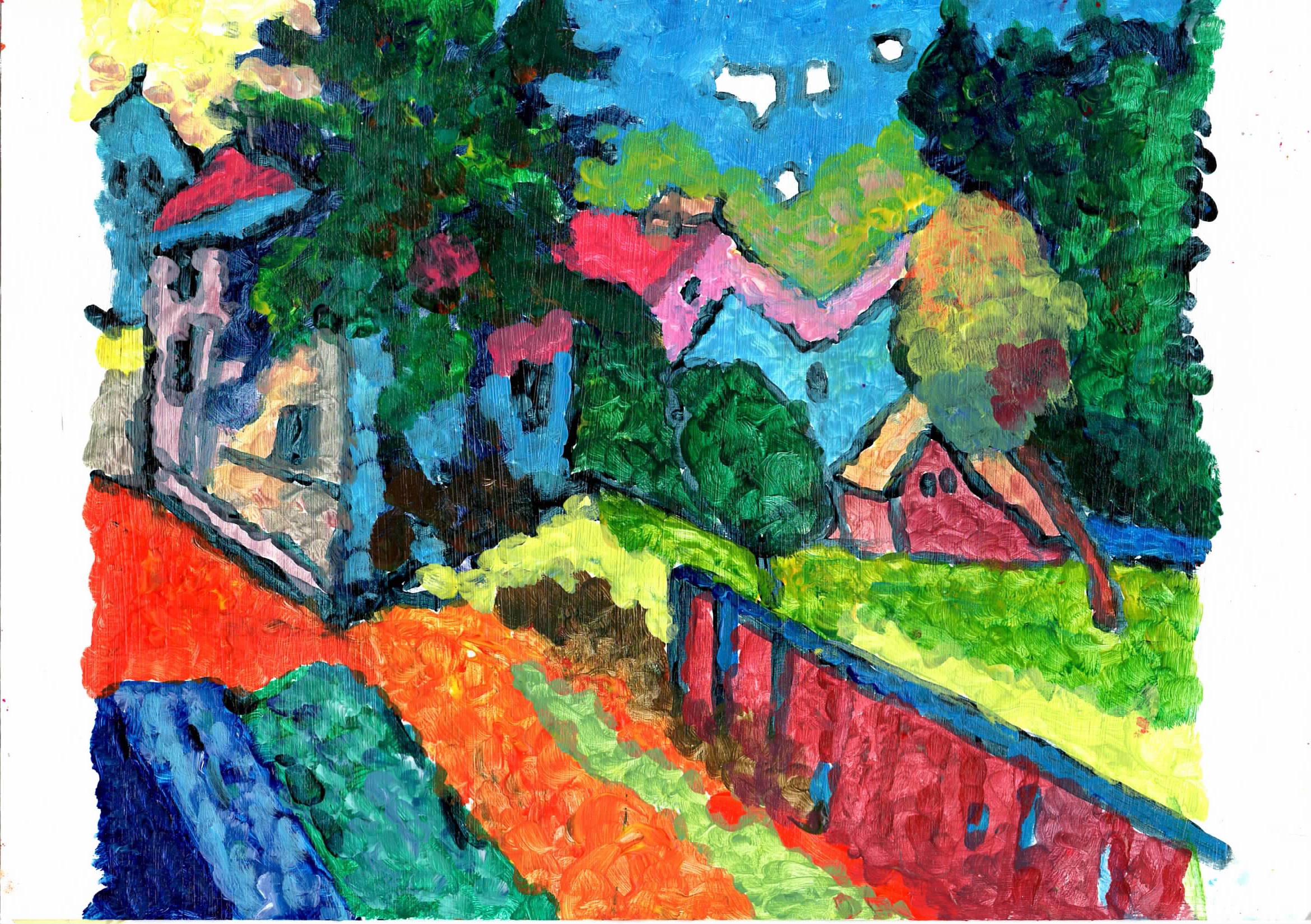
wba41 Acrylic on A4 paper - fter my work Wakefield Bridge - Bright colours, but uninteresting composition. The low contrast between the bridge and The Hepworth somewhat spoil it. The horizontal bar that is the bride blocks the eye moving around the painting. |
 |
flla41 Acrylic on A4 paper - after a LS Lowery at Hepworth gallery - done in a bit of a hurry, still try to wonder if I should put some people into it, but not sure what colour to use.. |
|
More Colour thoery. Painting with contrast, tints and dabs. |
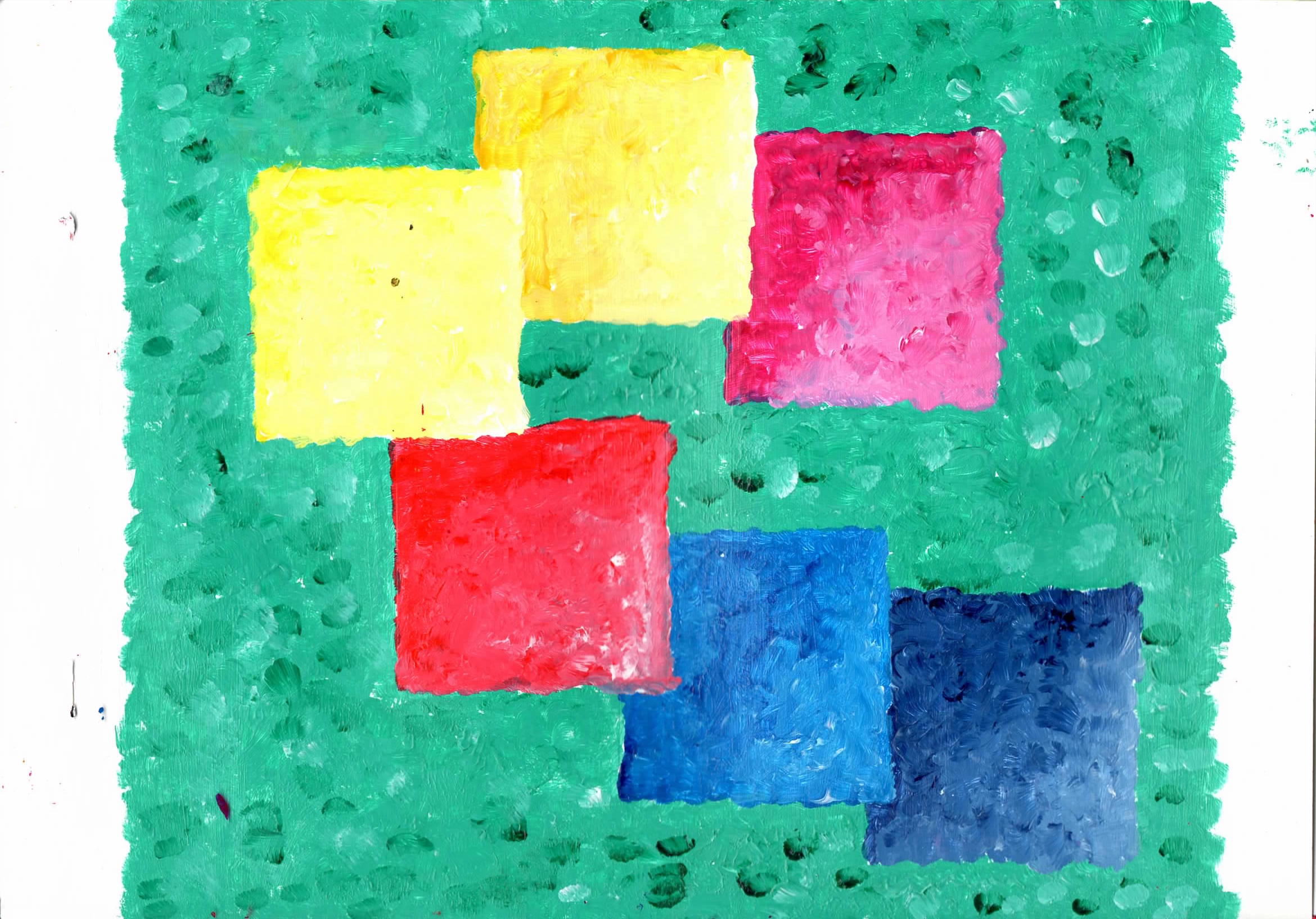 |
cta418 Acrylic on A4 paper - Colour theory with contrast, tints and dab painting. I think this is a lively painting with movement. |
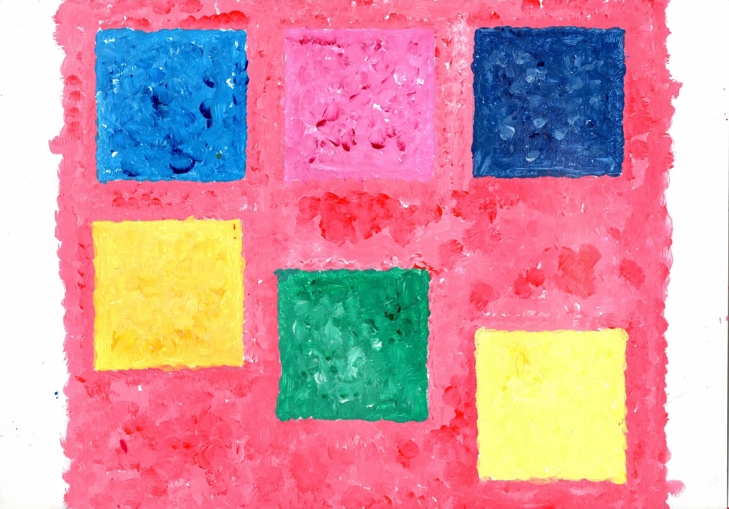 |
cta419 Acrylic on A4 paper - Colour theory with contrast, tints and dab painting. The composition makes it dull. |
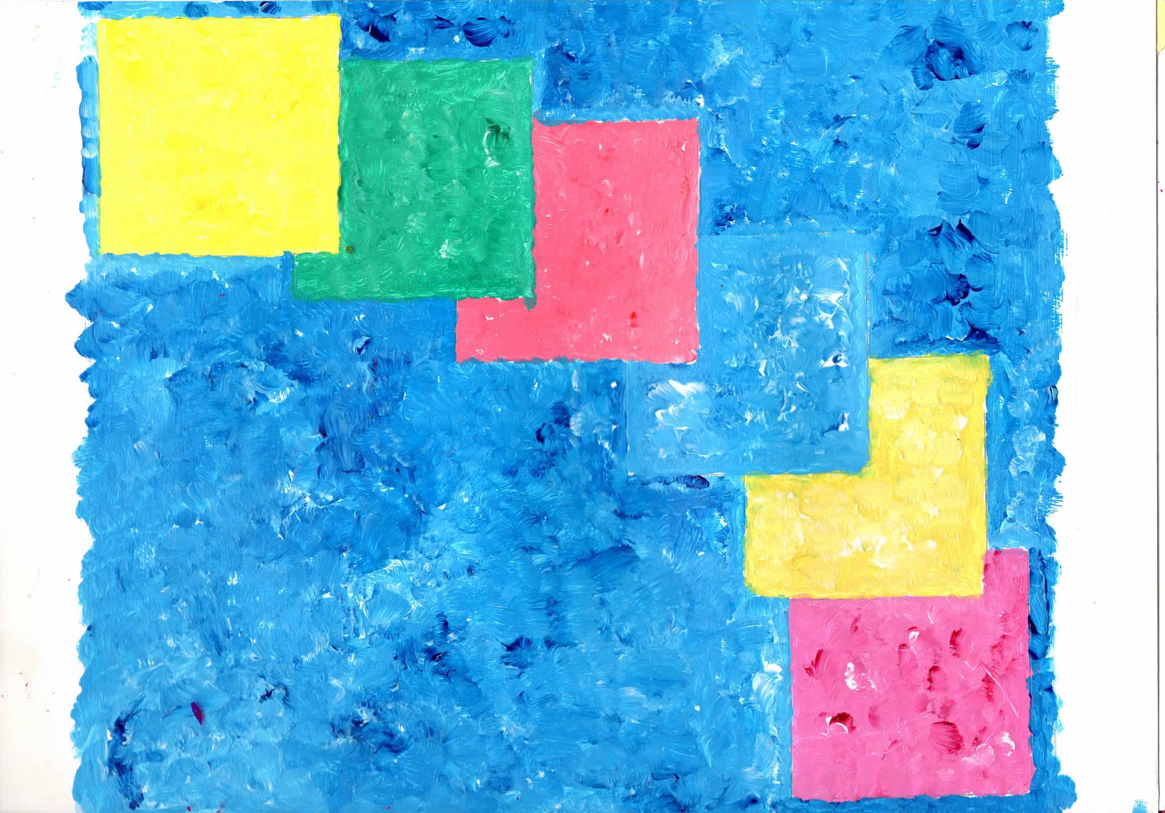 |
cta420 Acrylic on A4 paper - Colour theory with contrast, tints and dab painting. I think this is a lively painting with movement. |
 |
cta421 Acrylic on A4 paper - Colour theory with contrast, tints and dab painting. The block of yellow has low contrast with the background. |
|
Landscapes - Painting with contrast, tints and dabs. Part seeing blossom trees and part thinking about D. Hockney series of iPad drawings of Normandy. |
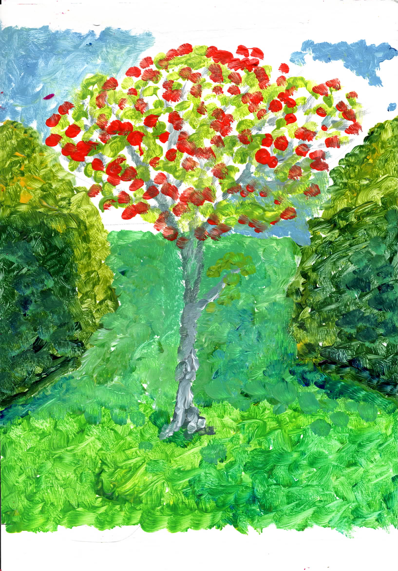 |
fla41 Acrylic on A4 paper - Very ugly, the more I seem to work on a painting the worse it get and it turned ugly very quickly. I was trying to use arial perspective, but changeing the greens towards the horizon I have made the background grass rise up into the air. |
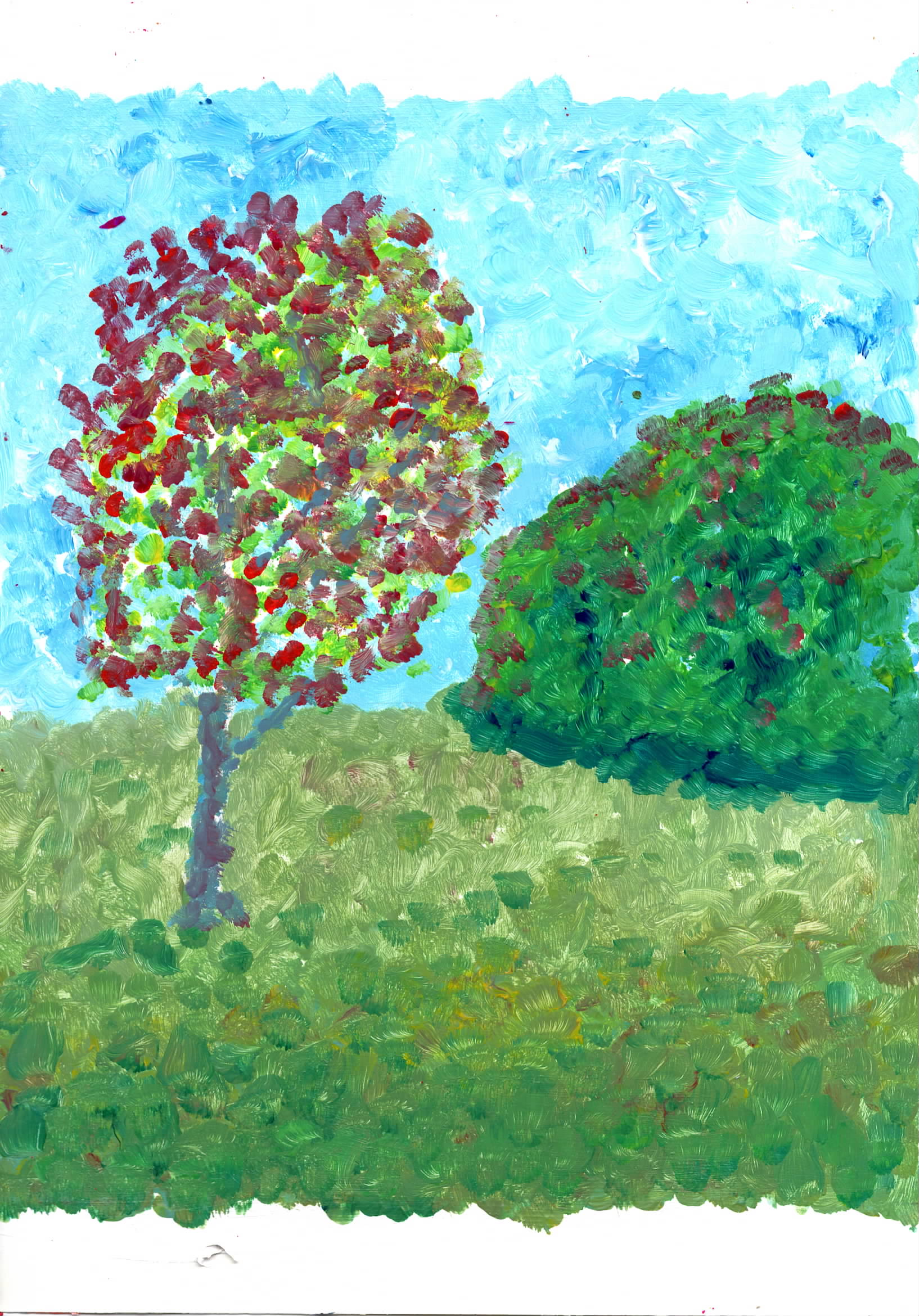 |
fla42 Acrylic on A4 paper - An ugly painting, the arial perspective is better defined. |
 |
fla43 Acrylic on A4 paper - from study 7 from Apr. 2021. Painted as part of the 703 study. This is a lively painting, |
|
Fauvist Weeds, based on photos of flowers where they are not expected to grow. |
 |
fwa41 Acrylic on A4 paper - From a painting from Nov 2013. Ended up very Margritte Like. Started with sky landscape started with the cracks, then added the greens over the wet red, so it was easier to reinforce the reds. |
 |
fwa42 Acrylic on A4 paper - Same source as above. |
 |
fwa43 Acrylic on A4 paper - From my own phote. Made a mistake, it was based on a poppy, put reds where some greens were meant to be . |
 |
fwa44 Acrylic on A4 paper - From same phote as above . |
|
A4 - D20 - Arcylic paint, from a sketch of 20 sided dice, drawn blind. From the 5 Words and other prompts. The original sketch was more lively/interesting than the painted works. |
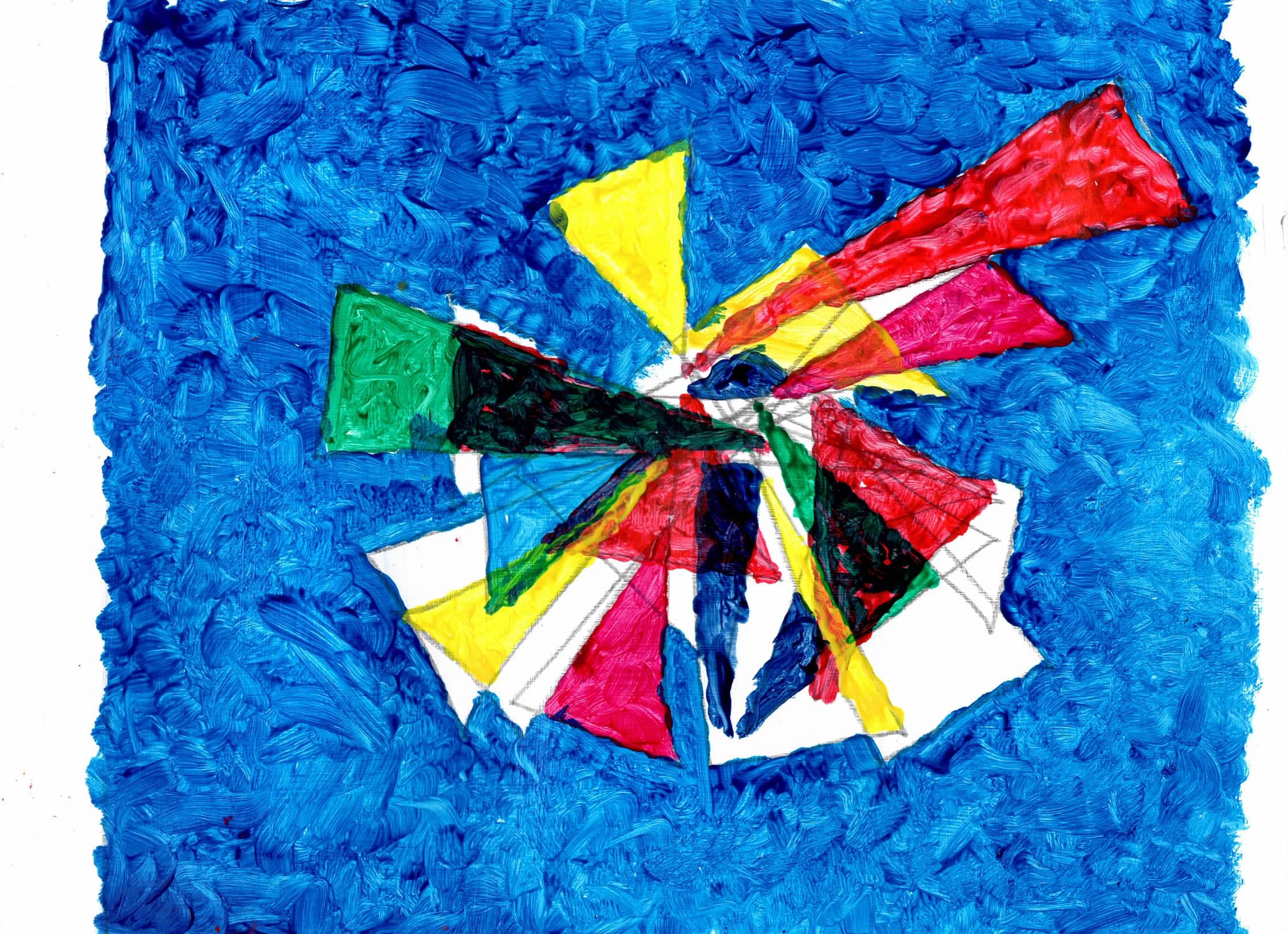 |
d20a41 Acrylic on A4 paper - The painting of the triangles is not true to the drawn images. |
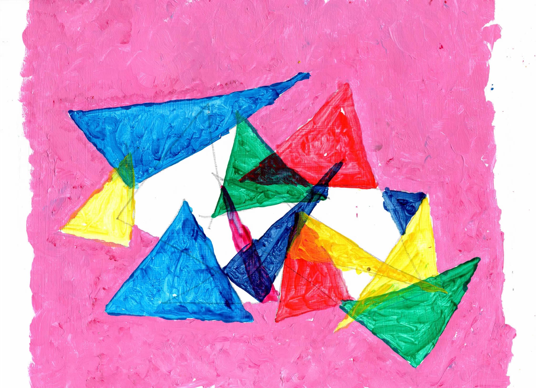 |
d20a42 Acrylic on A4 paper - The painting of the triangles is not true to the drawn images. |
|
Dreams series - Images from 2 different nights dreams, each time there were many similar paitings forming a series. These are just studies towards further works. |
 |
dr1a41 Acrylic on A4 paper - I painted it in landscape, but it was a bit dull, turned it to portrait and a tree appeared. A lively painting. |
 |
dr2a41 Acrylic on A4 paper - Full of colour and pattern. A lively painting. |
|
Copies of Matisse works - studies of studies, used as a way to better understand Fauvist landscapes. Matisse's use of a white background with bright colours suits my style and inclination for really bright colours. From these works I gained a greater understanding directionality in brush marks. |
 |
fma41 Acrylic on A4 paper - Copy of ”Landscape at Collioure - Collioure, summer 1905” Matisse - The shape of the path is not as clear as in the original study, most of the couloirs are totally true to the original. A lively painting. |
 |
fma42 Acrylic on A4 paper - Copy of ”Landscape near Collioure (study for The Joy of Life). 1905” Matisse - Most of the couloirs are totally true to the original. A lively painting. |
|
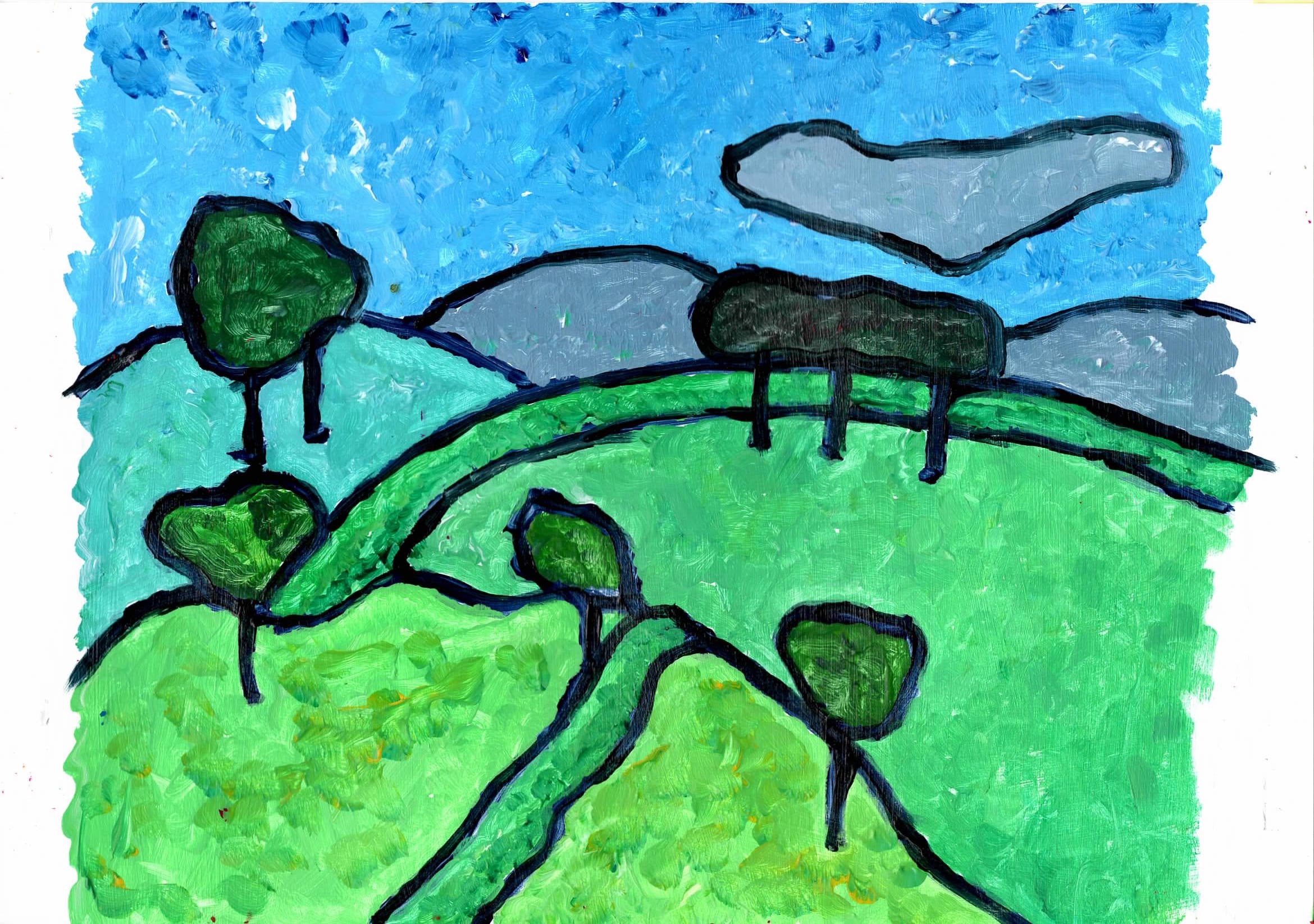
Copies of Kandinsky works - studies of paintings, used as a way to better understand Fauvist landscapes. In his landscapes, Kandisky, sometimes used a lot of dark blocks overlayed with brighter colours. The light over dark also frames the forms he descibes. This dose provide contrast and the colours show, but I find it can 'dull down' the overall painting. He seems to use a technique of taking a hue, then adds an opposit to darken it the lighten the hue by adding white and paining it storkes, slightly altering the tone as he goes along. |
 |
A4 paper - copy of "View of Murnau. 1908". Not exact copy but I enjoyed doing it. |