MLR Gallery - Back to Entrance
|
The colour theory is a series of paintings to explore colour and pure paint using the selected range of colours as described in how I paint to explore them and understand how they work. These are vert simplistic but are still contain some of the work I am most pleased with. |
|
|
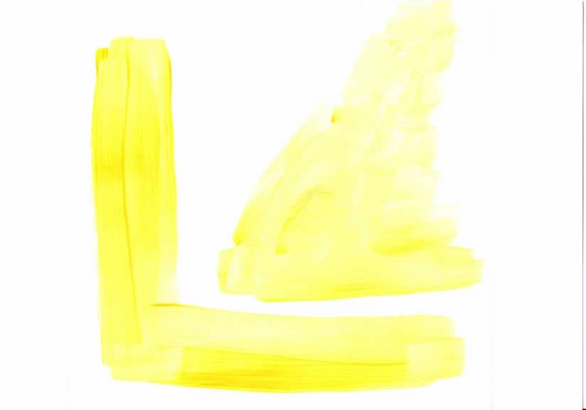
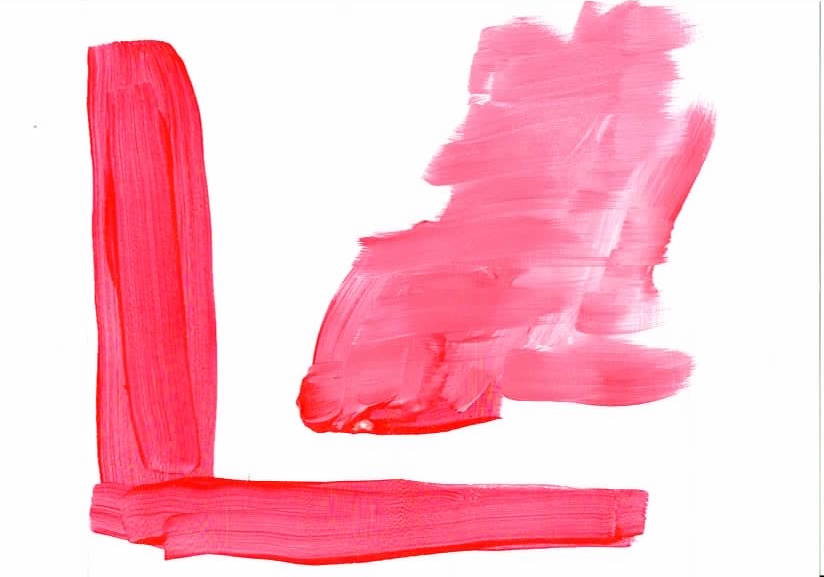
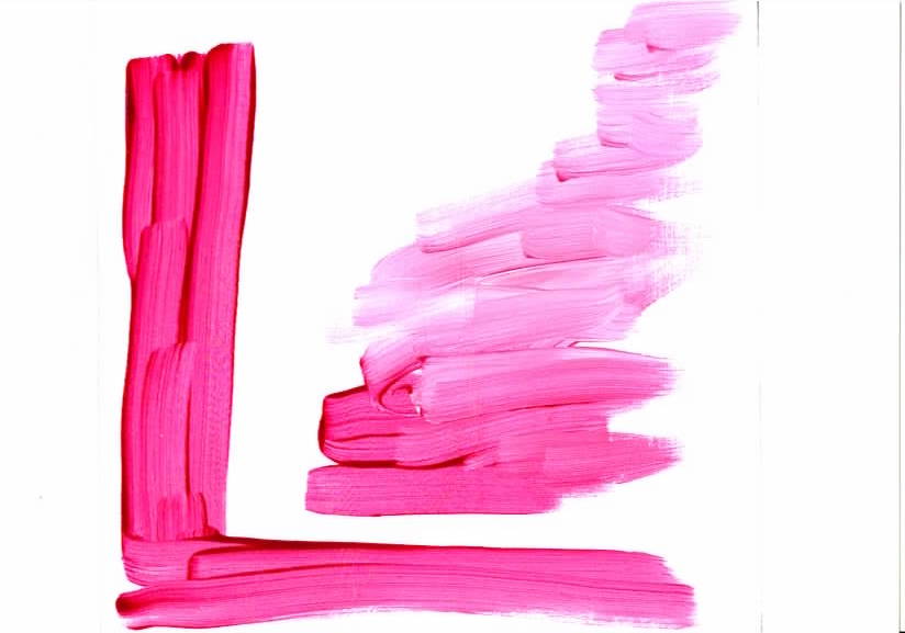
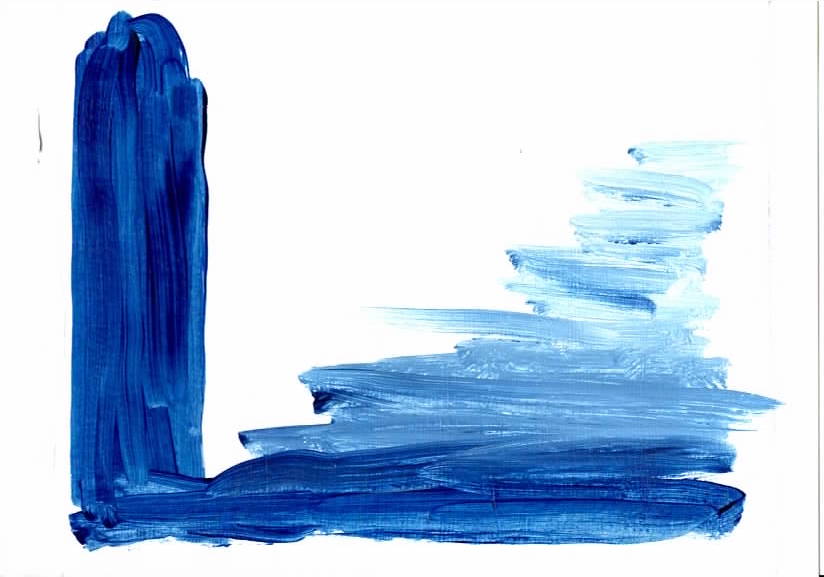
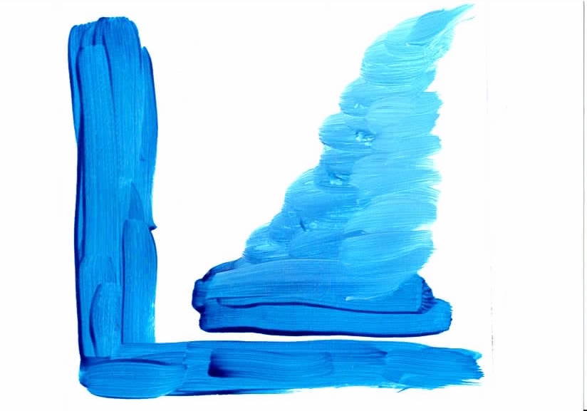
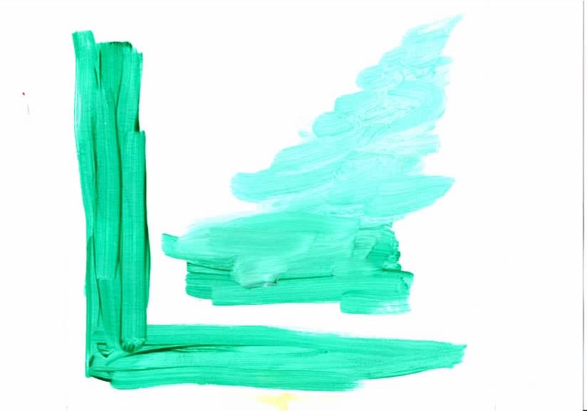
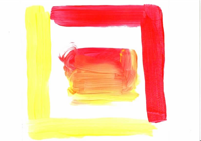
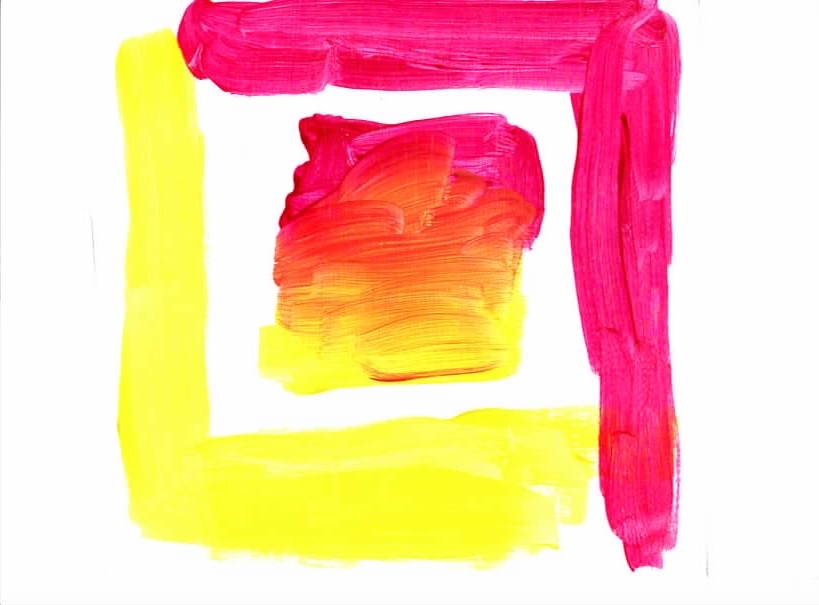
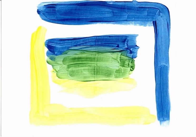
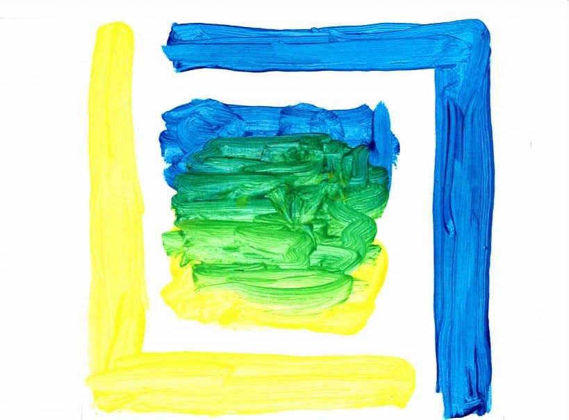
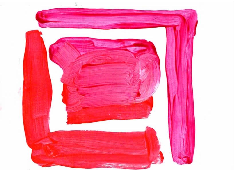
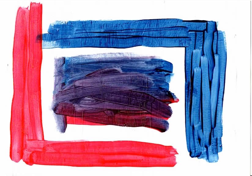
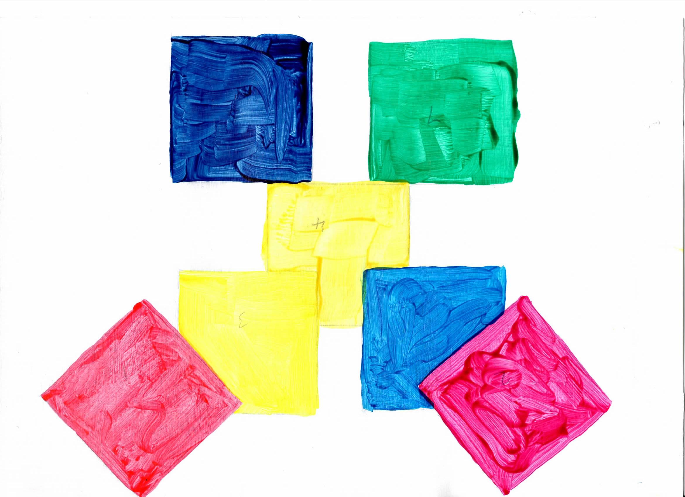
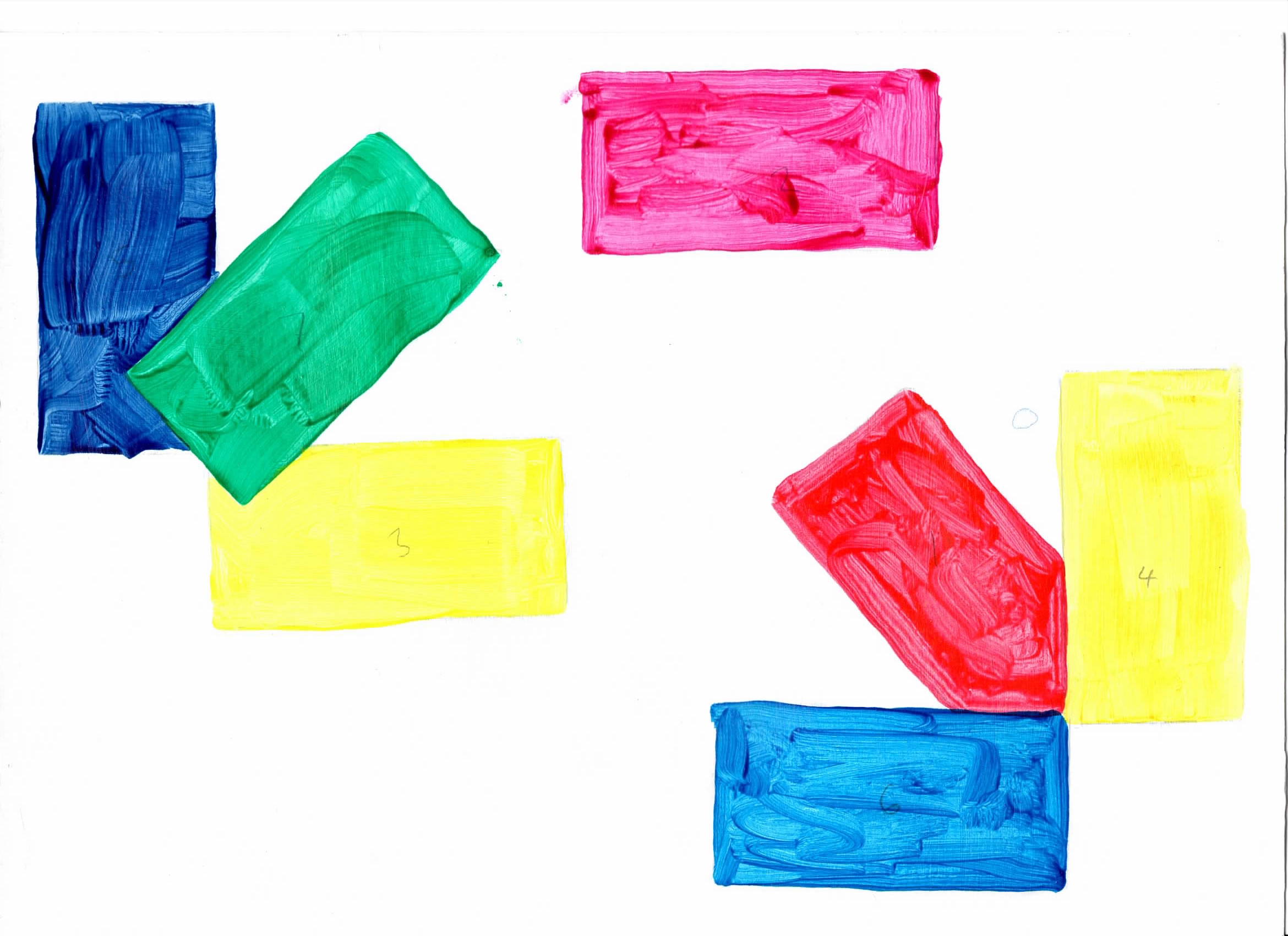
The first block of works are simple colour swatches, in the initial exploration of the materials. |
|
 |
cta - A5 acrylic on paper white base with white & blue (white base not dry)) |
 |
ctb - A5 acrylic on paper white base with white & blue |
A5 acrylic on paper: white + gloss with white & colour
A5 acrylic on paper: white + gloss with two colours
 |
 |
 |
 |
 |
 |
 |
| ct1 | ct2 | ct3 | ct4 | ct5 | ct6 | ct7 |
 |
 |
 |
 |
 |
 |
 |
| ct12 - A5 | ct13 - A5 | ct14 - A5 | ct15 - A5 | ct16 - A5 | ct17 - A5 | ct23 - A5 |
 |
 |
 |
 |
 |
 |
 |
| ct24 - A5 | ct25 - A5 | ct26 - A5 | ct27 - A5 | ct34 - A5 | ct35 - A5 | ct36 - A5 |
 |
 |
 |
 |
 |
 |
 |
| ct37 - A5 | ct45 - A5 | ct46 - A5 | ct47 - A5 | ct56 - A5 | ct57 - A5 | ct67 - A5 |
The colour theory cta41 & ct42 use the colours but in a random placement. These two paintings are happy combination of an imagined work and a realised work. |
|
 |
cta41 - A4 acrylic on paper white + gloss with colours I like the piece |
 |
cta42 - A4 acrylic on paper white + gloss with colours I like the piece |
|
Flowers and vases favourite subjects and so make an easy place to start making pictures. |
|
 |
cta43 - Flowers 1, A4 acrylic on paper white + gloss with colours |
 |
cta44 - Flowers 2, A4 acrylic on paper white + gloss with colours colours, apart from background, randomly chosen. |
 |
cta45 - Flowers 3, A4 acrylic on paper white + gloss with colours colours randomly chosen. |
 |
cta46a - Start of Flowers 4, A4 acrylic on paper white + gloss with colours |
 |
cta46b - Start of Flowers 4, A4 acrylic on paper more colours |
 |
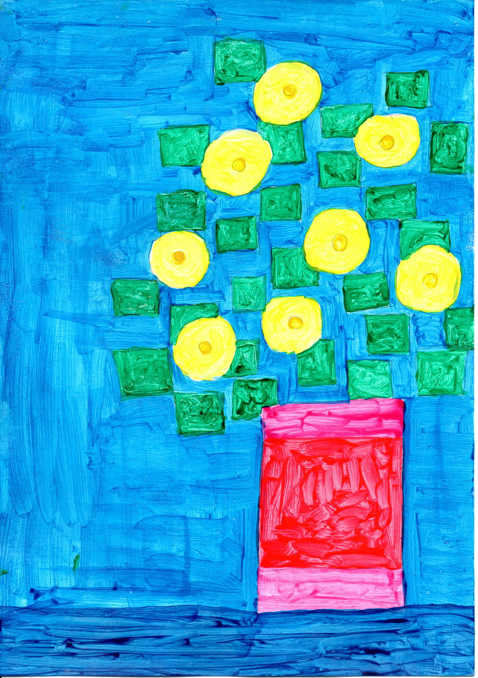
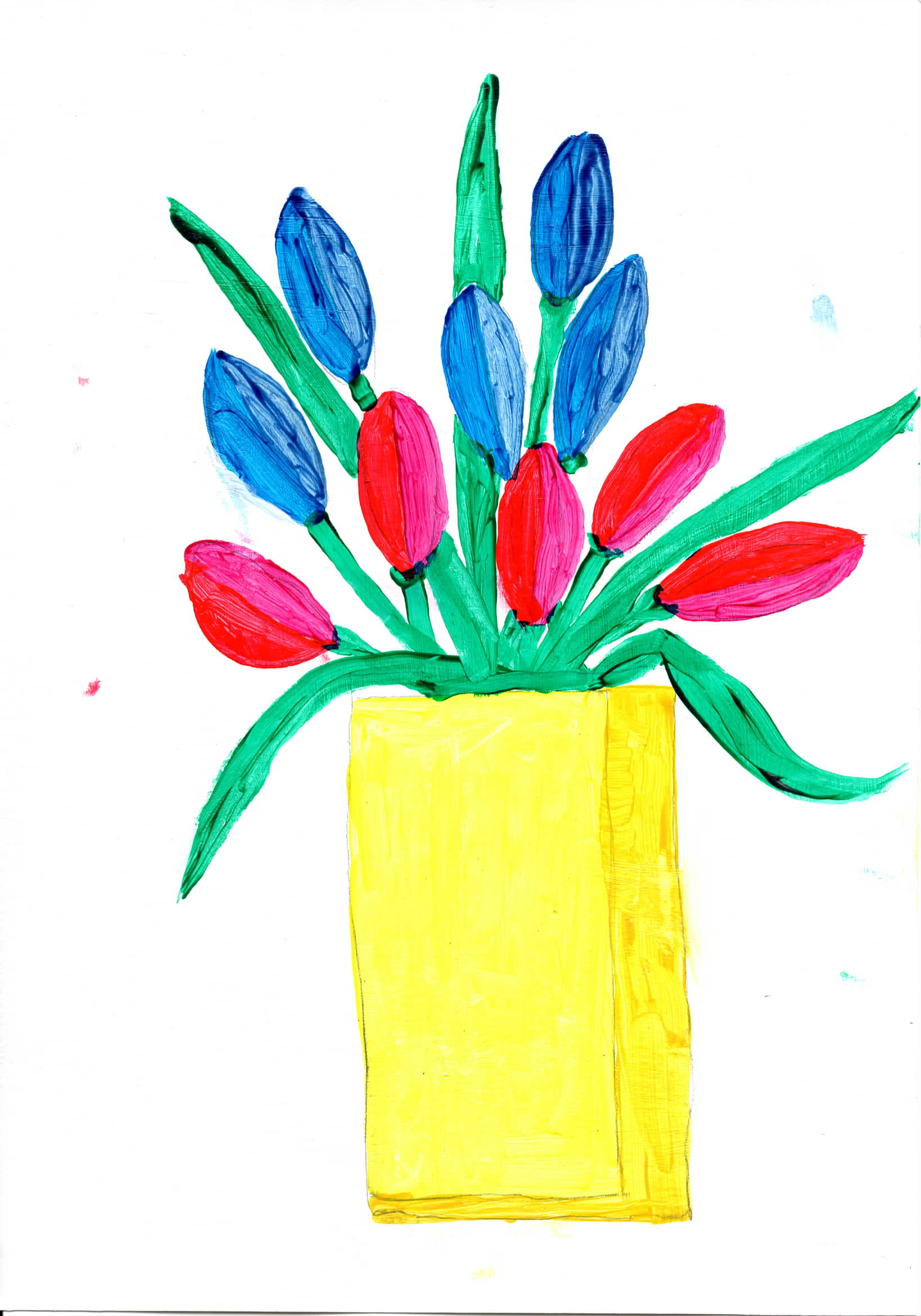
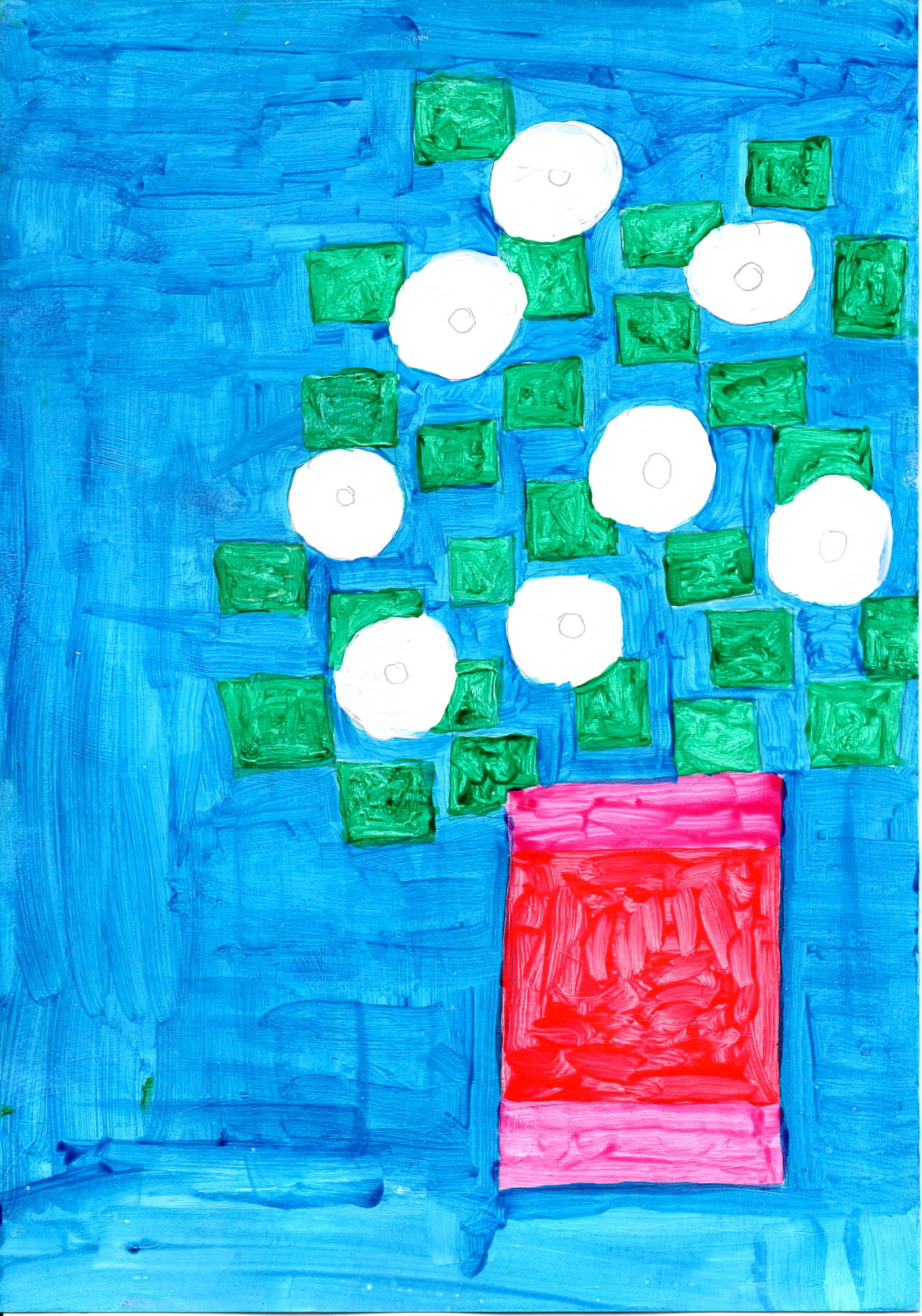
cta46 - Flowers 4, A4 acrylic on paper My favorite painting of the college module |
 |
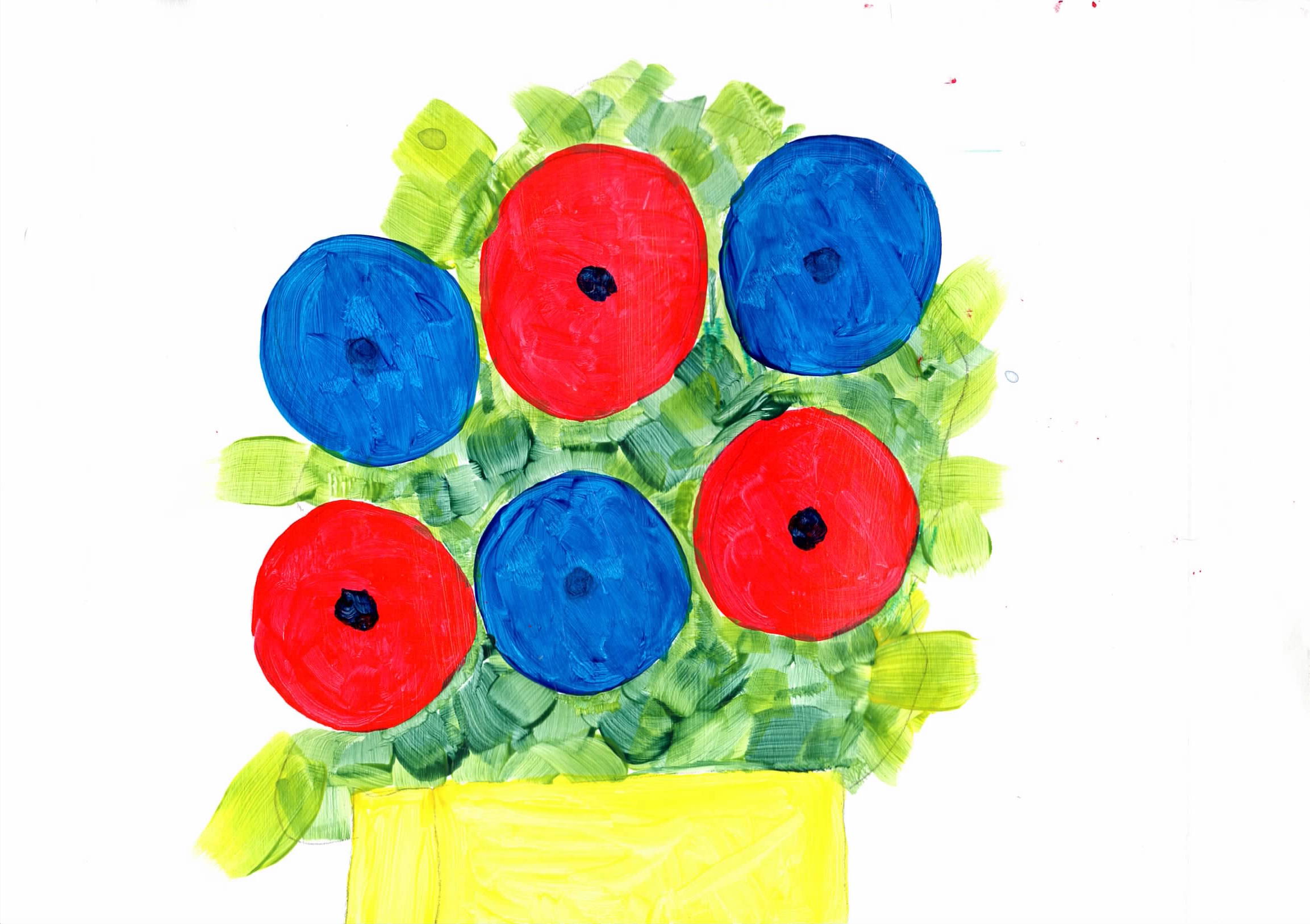
cta47 - Flowers 5, A4 acrylic on paper |
|
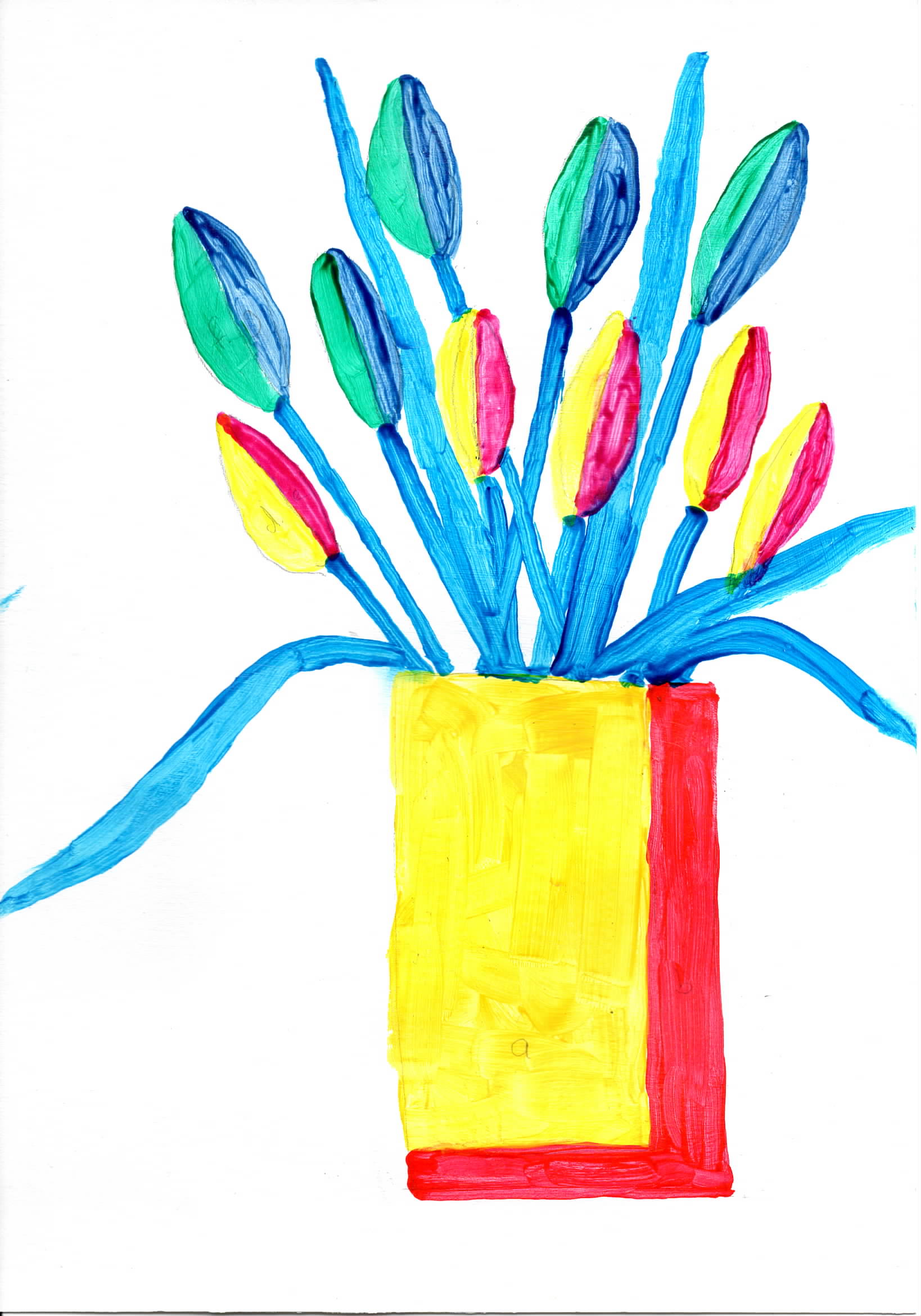
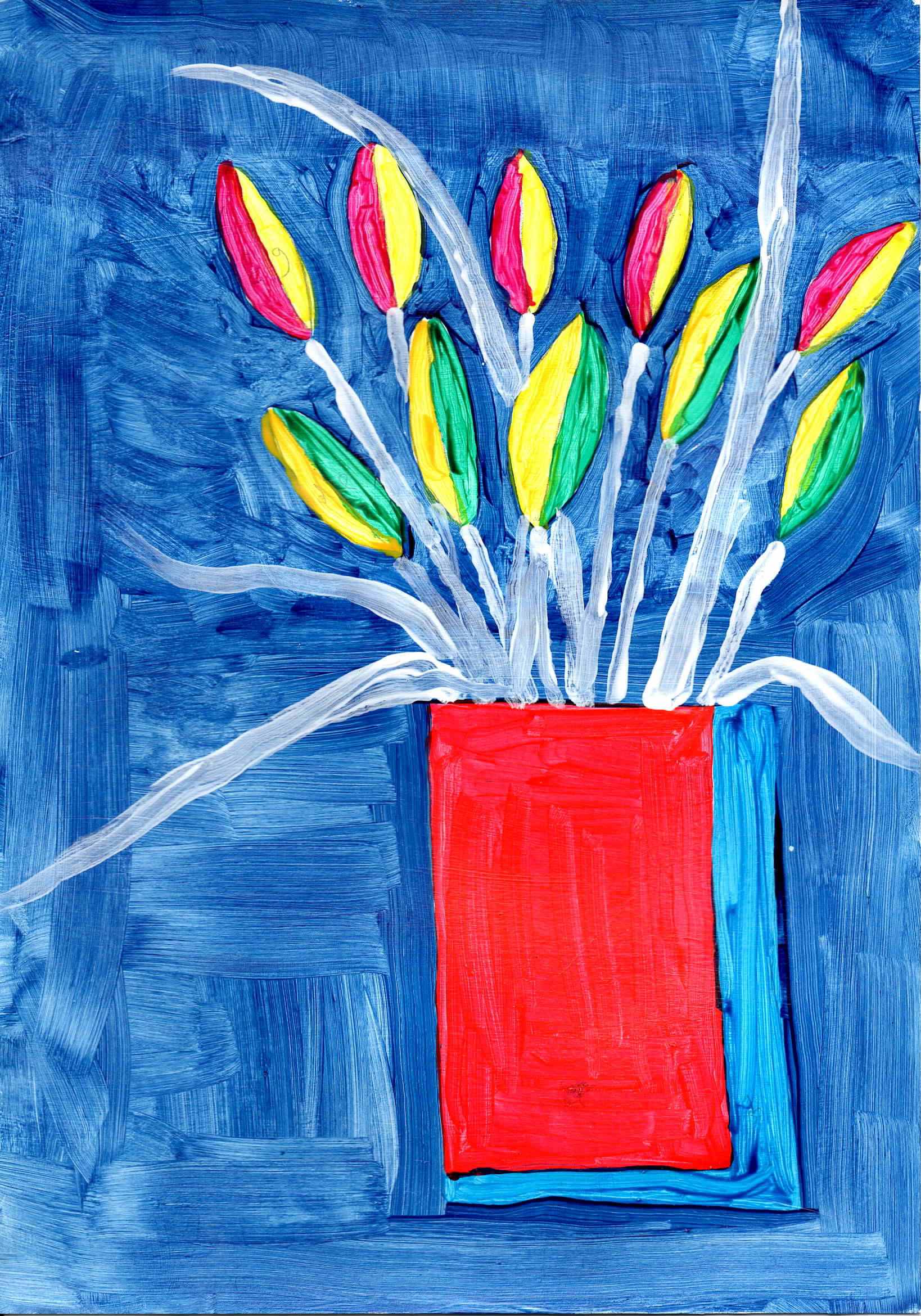
I was trying to do paintings where the main leaves were defined by a single large brush strock, the background added in after. Again carried out as a series to explore various colour themes. |
|
 |
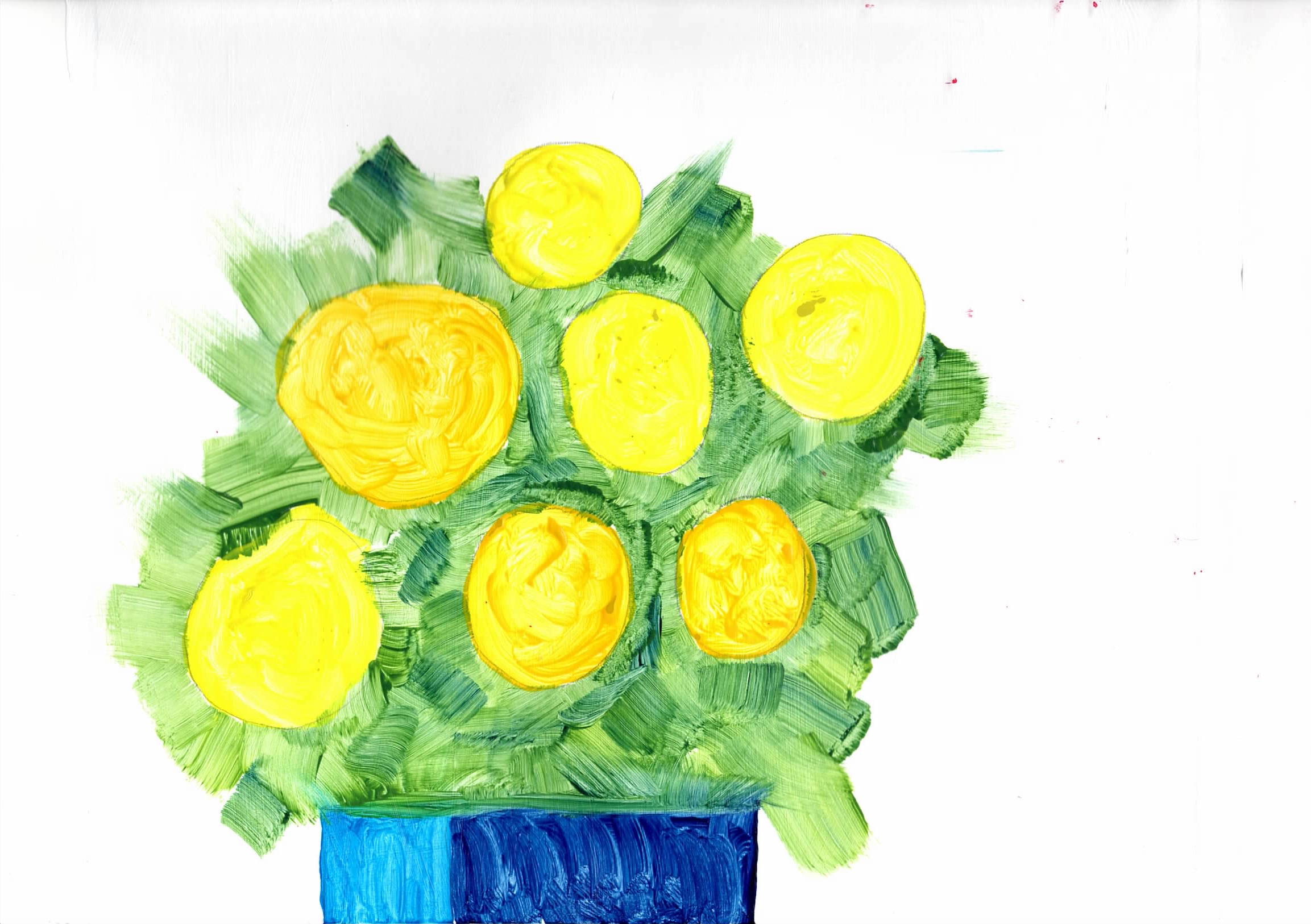
cta415 Flowers 6 - A4 acrylic on paper |
 |
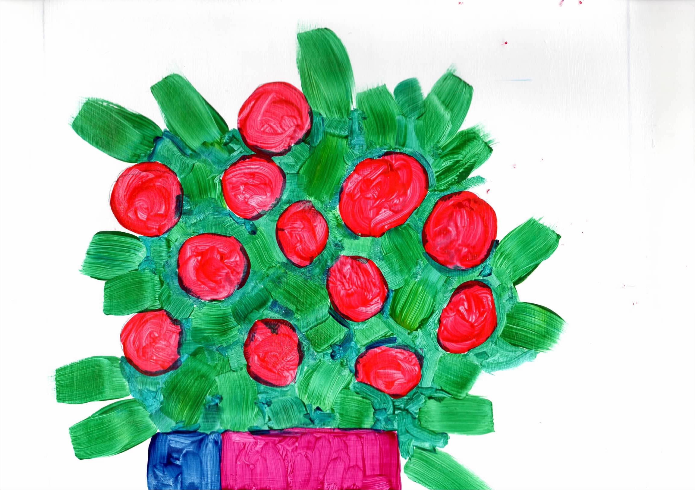
cta416 Flowers 7 - A4 acrylic on paper |
 |
cta417 Flowers 8 - A4 acrylic on paper |
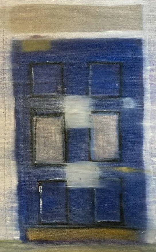
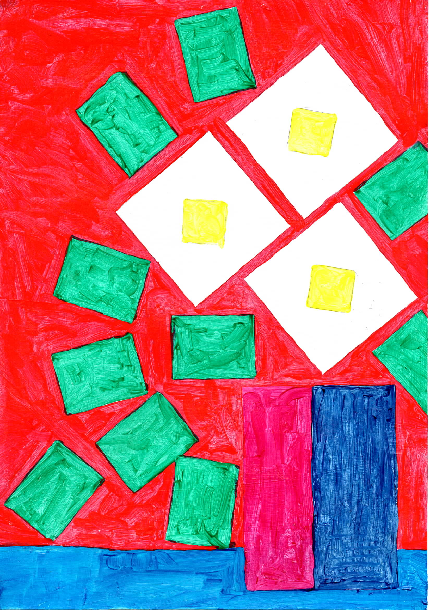
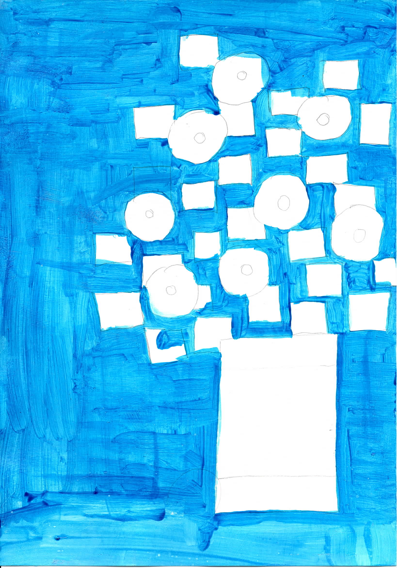
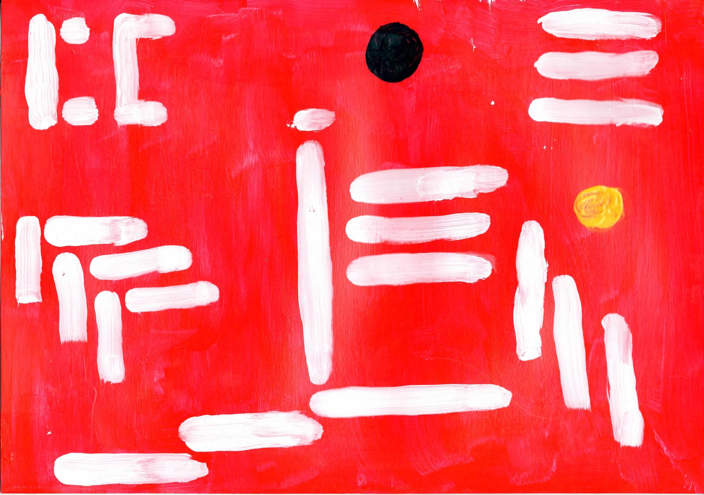
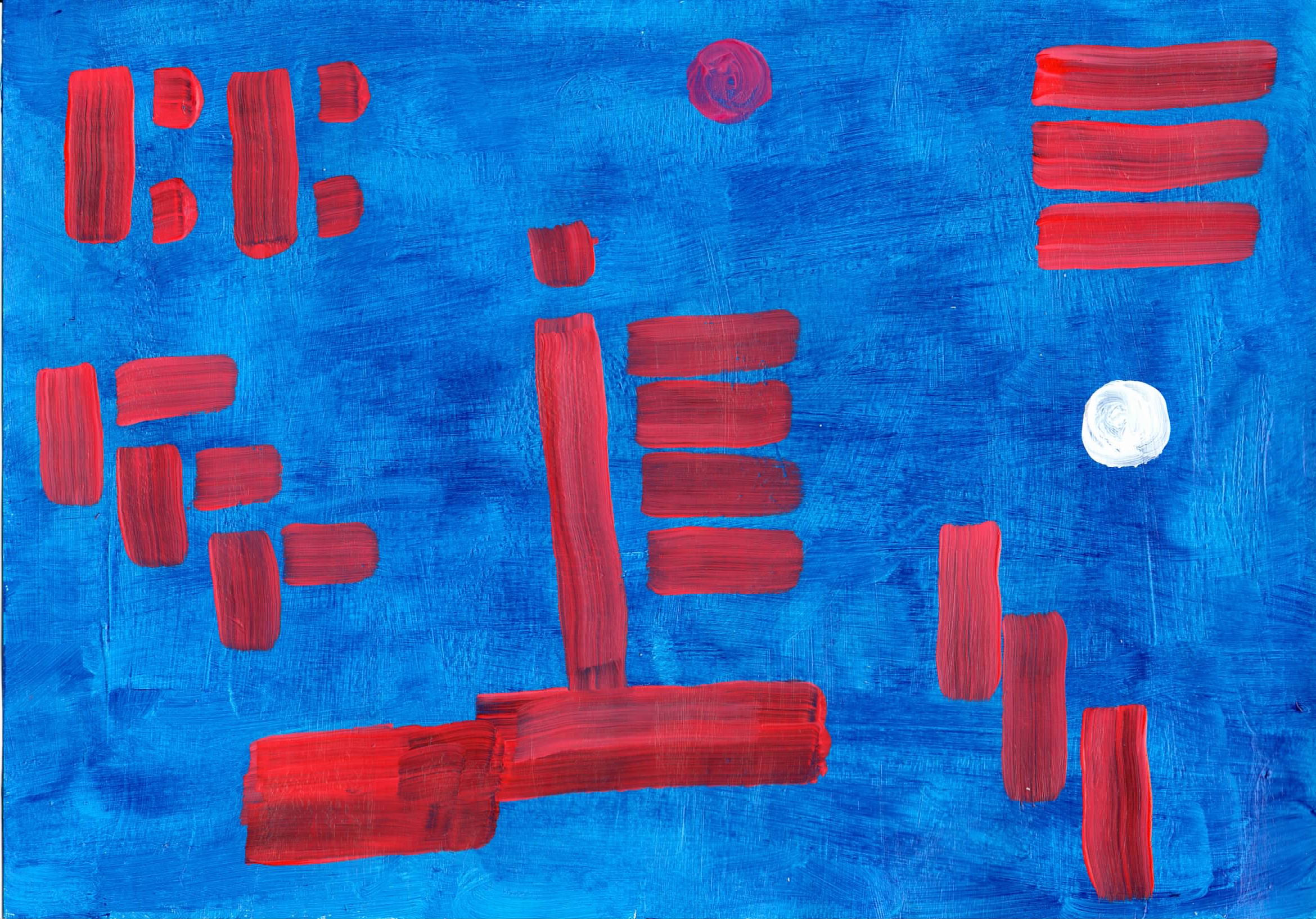
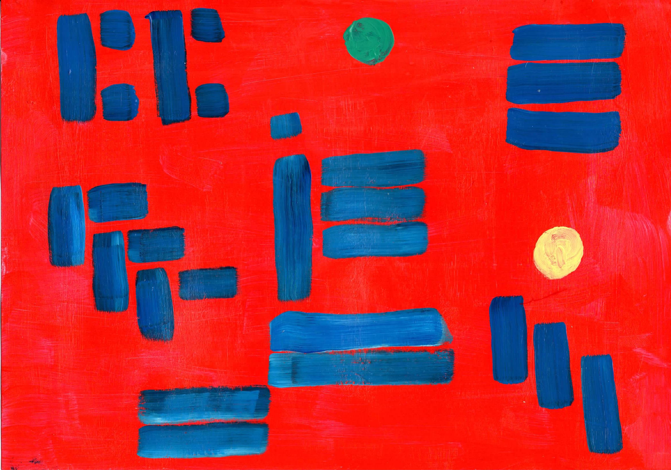
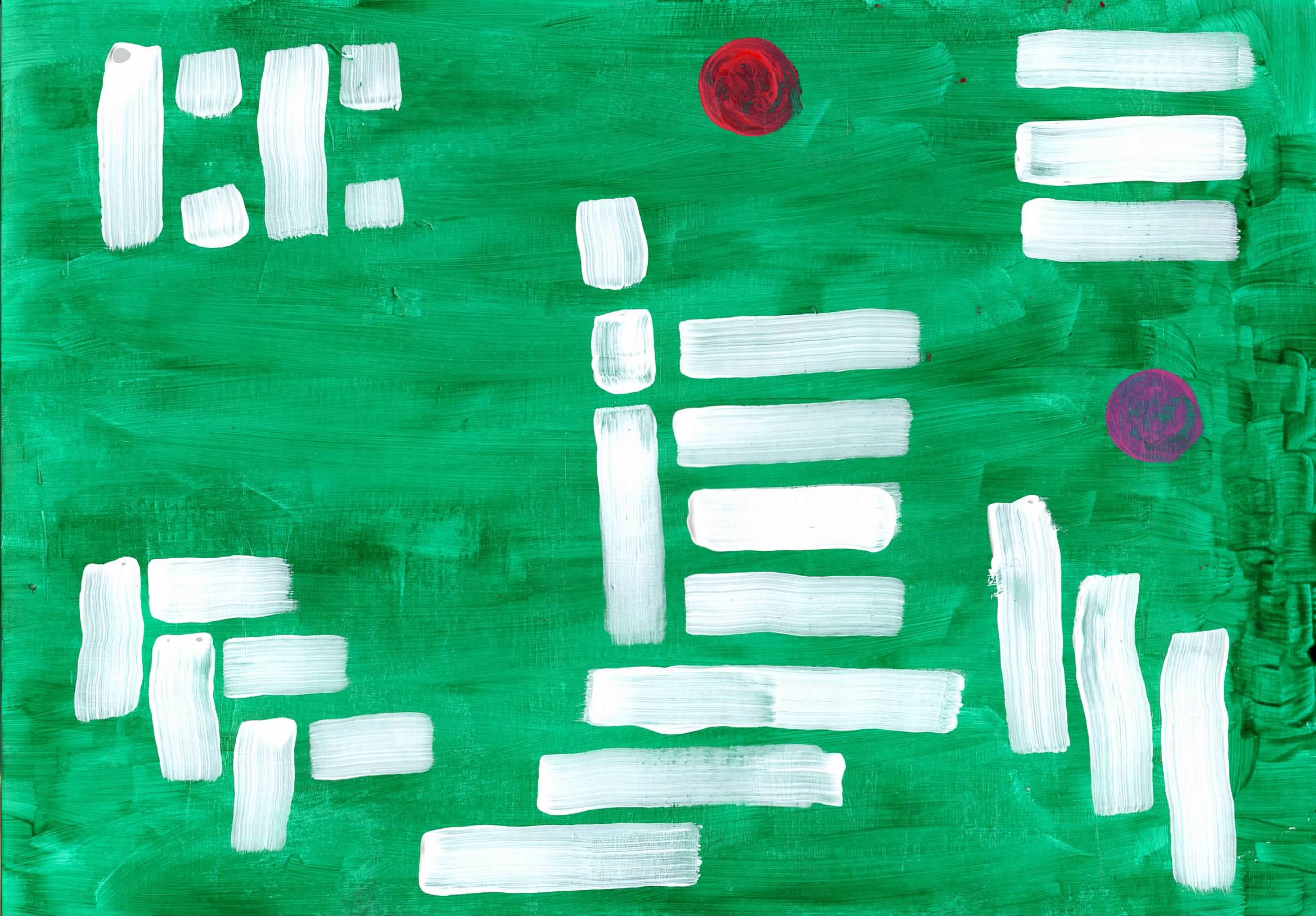
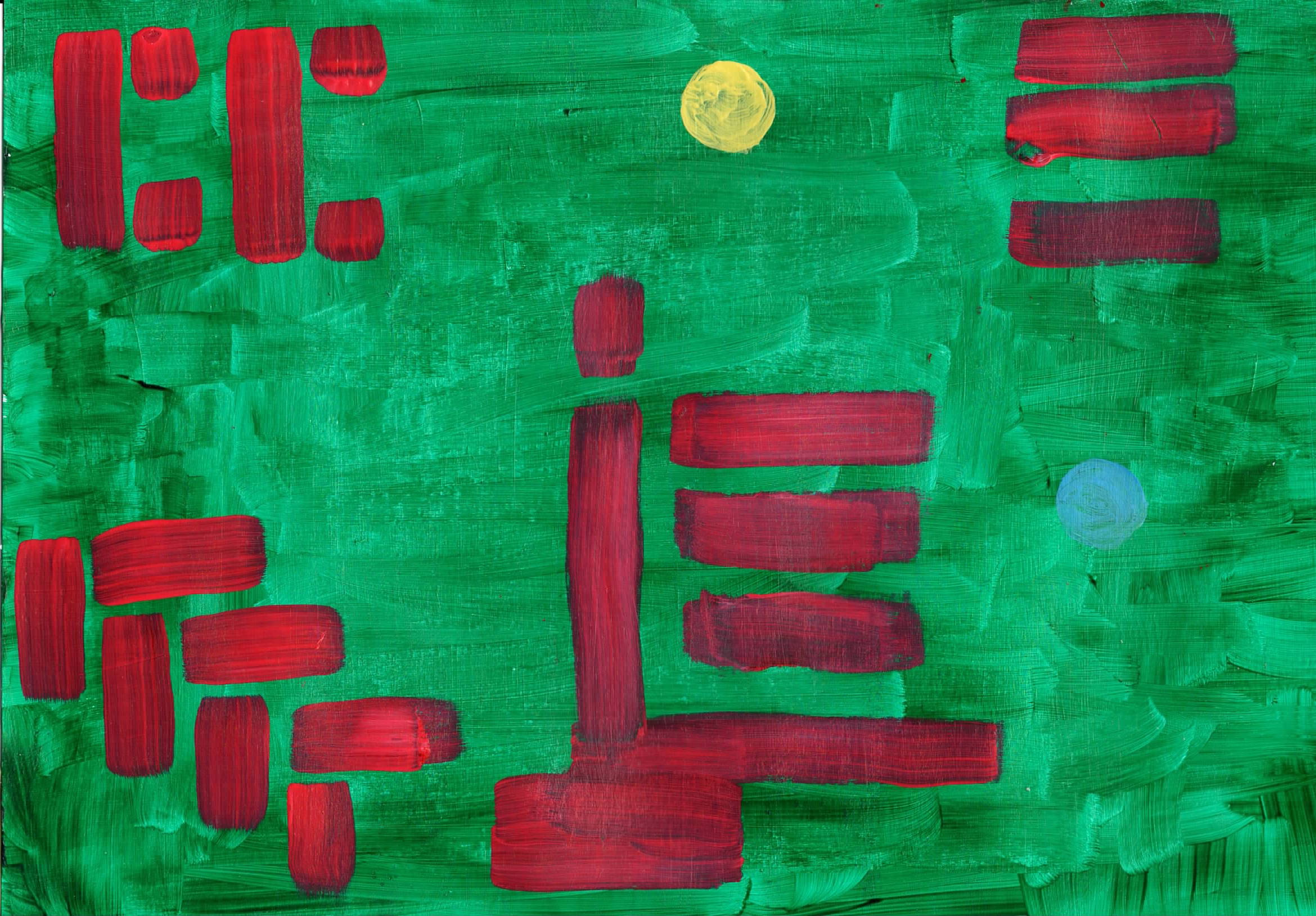
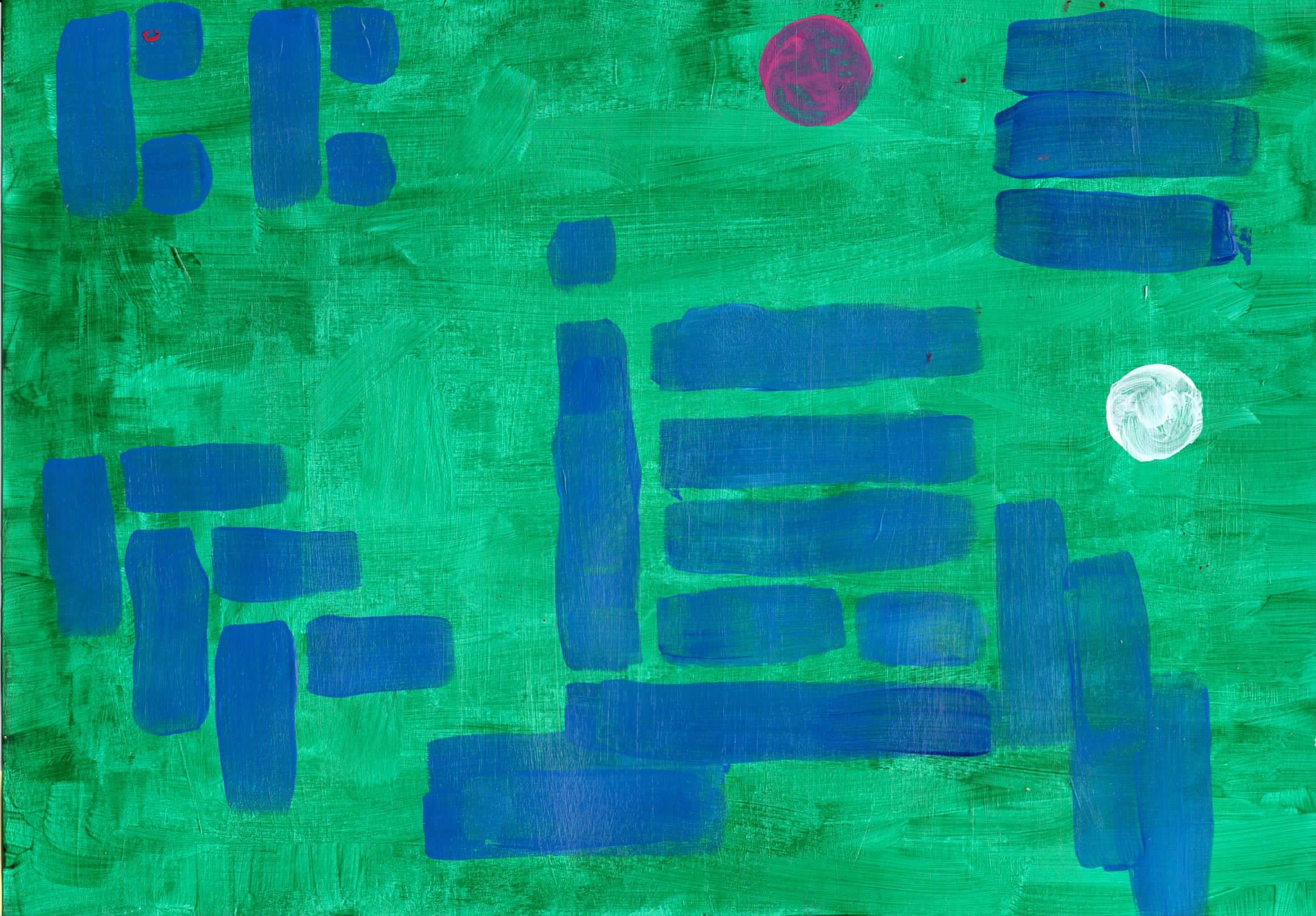
No Meaning Series - I started with a piece of paper that had painted with a blue background and then deciding what to do with it took at the white paint and made a few very simple shapes on it. I liked it so much that I decided to do it into a series. The reason is called they are called NO Meaning is that it was attempt to paint anything meaningful. I slihgtly changed each version to put som inyerest into each one. (However the Chinese symbol for ‘3’ is there and so is the maths symbol ‘i)’. |
|
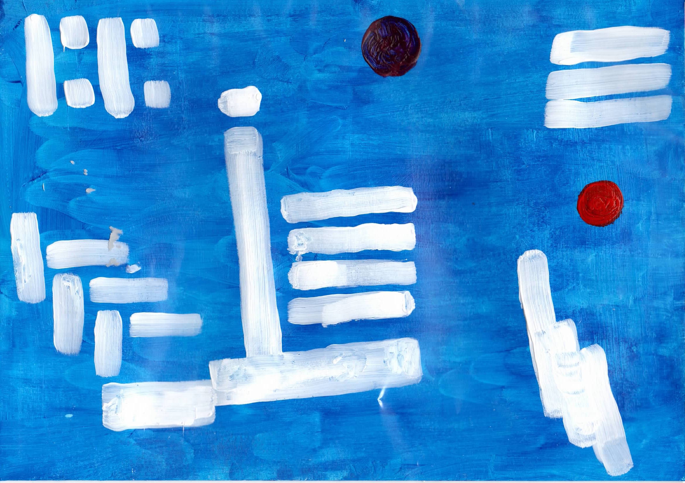 |
cta48 No Meaning 1 - A4 acrylic on paper |
 |
cta49 No Meaning 2 - A4 acrylic on paper |
 |
cta410 No Meaning 3 - A4 acrylic on paper |
 |
cta411 No Meaning 4 - A4 acrylic on paper |
 |
cta412 No Meaning 5 - A4 acrylic on paper |
 |
cta413 No Meaning 6 - A4 acrylic on paper |
 |
cta414 No Meaning 7 - A4 acrylic on paper |
|
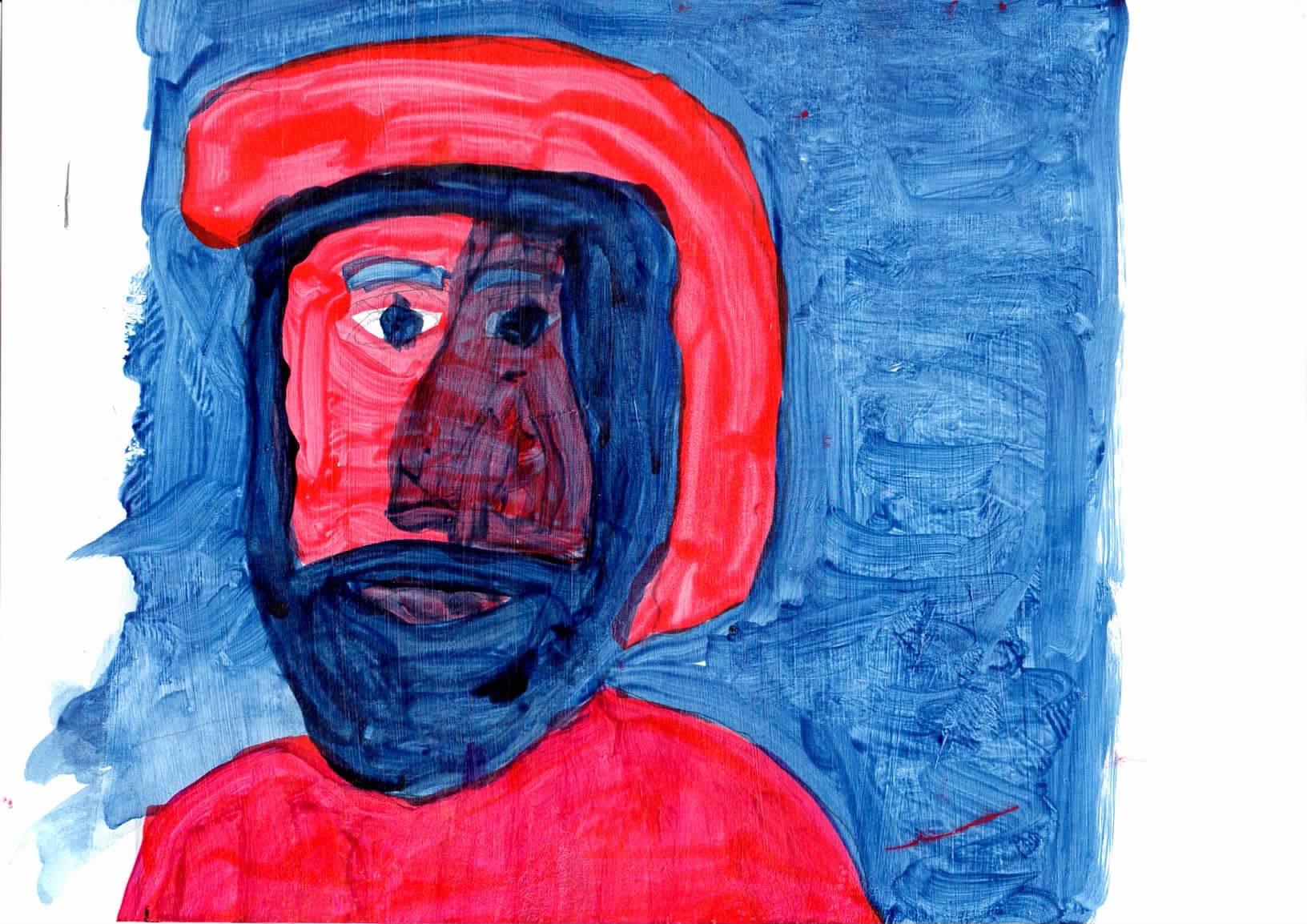
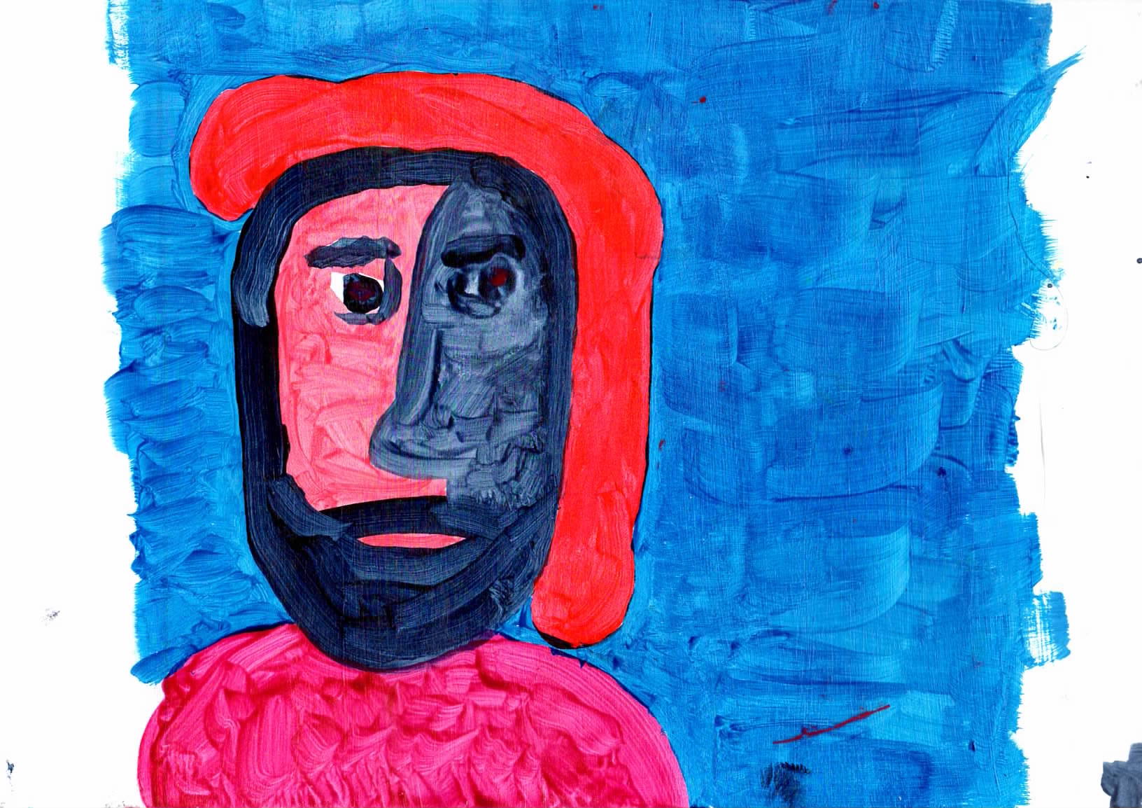
From an imagined face as I woke up, using very bright reds and blues in a Fauvist style. I wanted to do a series of paintings of faces. Loosely based the original face was from a Matisse portrait ‘André Derain’,1905 |
|
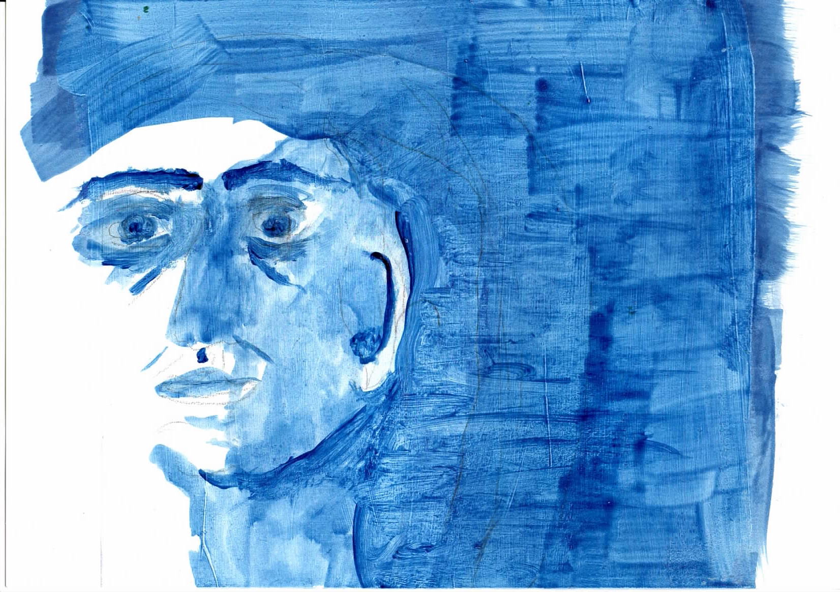 |
cta51b - Face 1 - Thin blue layers applied then the shadows /dark areas of the face applied - acrylic on paper Reminds me of the Goya painting of the (future) Duke of Wellington There are many issues with the composition, but this is a story about painting. |
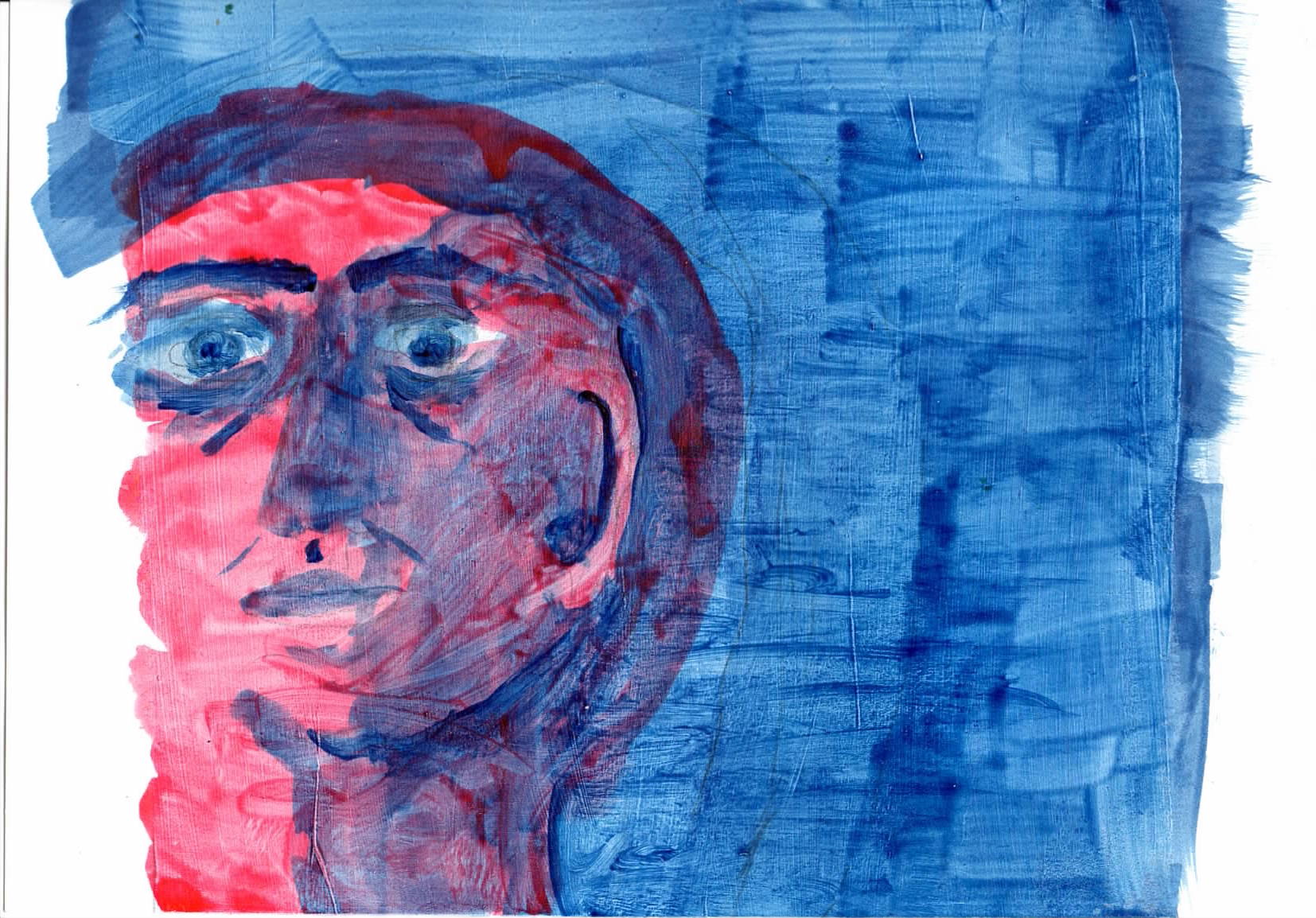 |
cta51 - Face 1 - acrylic on paper The painting uses glazed thin transpartent layers to achive shadows and darker tones What I thought was going to be a masculin face turrned out as femanin. Reminds me of a Roman Fresco. I liked the effect and painting but it was not the painting I was trying to achive. I liked he composition with the face towards the left side and colour plane to the right. The anatomy was not good (ear is wrong and eyes are very unsemetrical). However using a shadow area to define the shape of the face worked. Reminds me of the Goya painting of the (future) Duke of Wellington There are many issues with the composition |
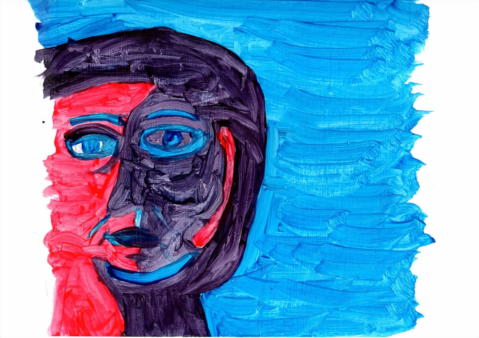 |
cta52 - Face 2 - acrylic on paper, paint mixed before applying This used pure colour, with no overpainting. A strong bright image. A prefered it it to the one above but it did not look like the image I was trying to achive. |
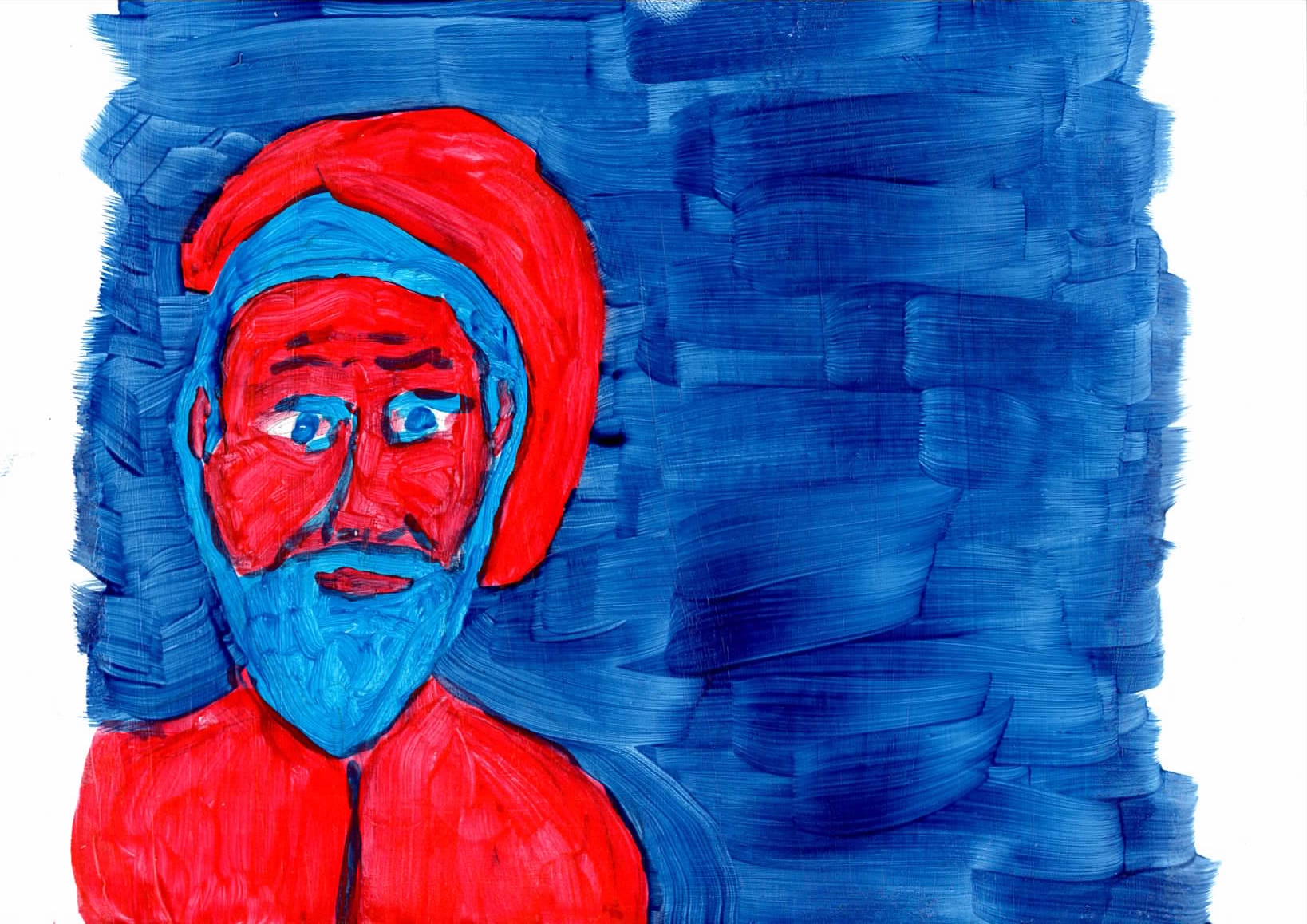 |
cta53 - Face 3 - acrylic on paper. The paint was out of the tubes The cap and beard added towards the painting I was working towards. But the blues needed to be swapped i the arrangement. The red for the cap, face and shirt were overpowering. The shape of the face was better. |
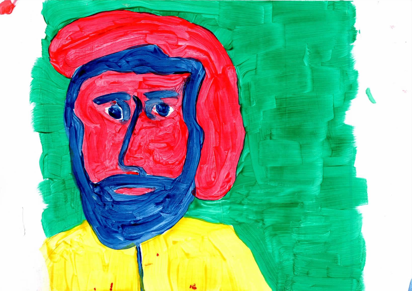 |
cta54 - Face 4 - acrylic on paper. The paint was out of the tubes I used some photos of my nephew as a reference. This was the best face I painted, but the green and yellow were not the colours I had imagined for the work. |
 |
cta55 - Face 5 - acrylic on paper. The paint was out of the tubes This was the closesr to face I wanted, but the colours were not quite what I wanted |
 |
cta56 - Face 6 - acrylic on paper. The paint was out of the tubes This was the closest to face I wanted. I was happy with it |